Our agile process at the WSJ means we are continually updating and redesigning the parts of our product which need attention. One of the highest trafficked pages, and the longest neglected, was our Market Data Center. The pages were so old they used headers, footers, and color palettes we’ve long since retired elsewhere on the site. We also knew we weren’t leveraging the provided data to their full potential. Many pages and useful tables were buried and hard to find. And so, with new editorial guidance and support, we set to updating the interface and the experience.
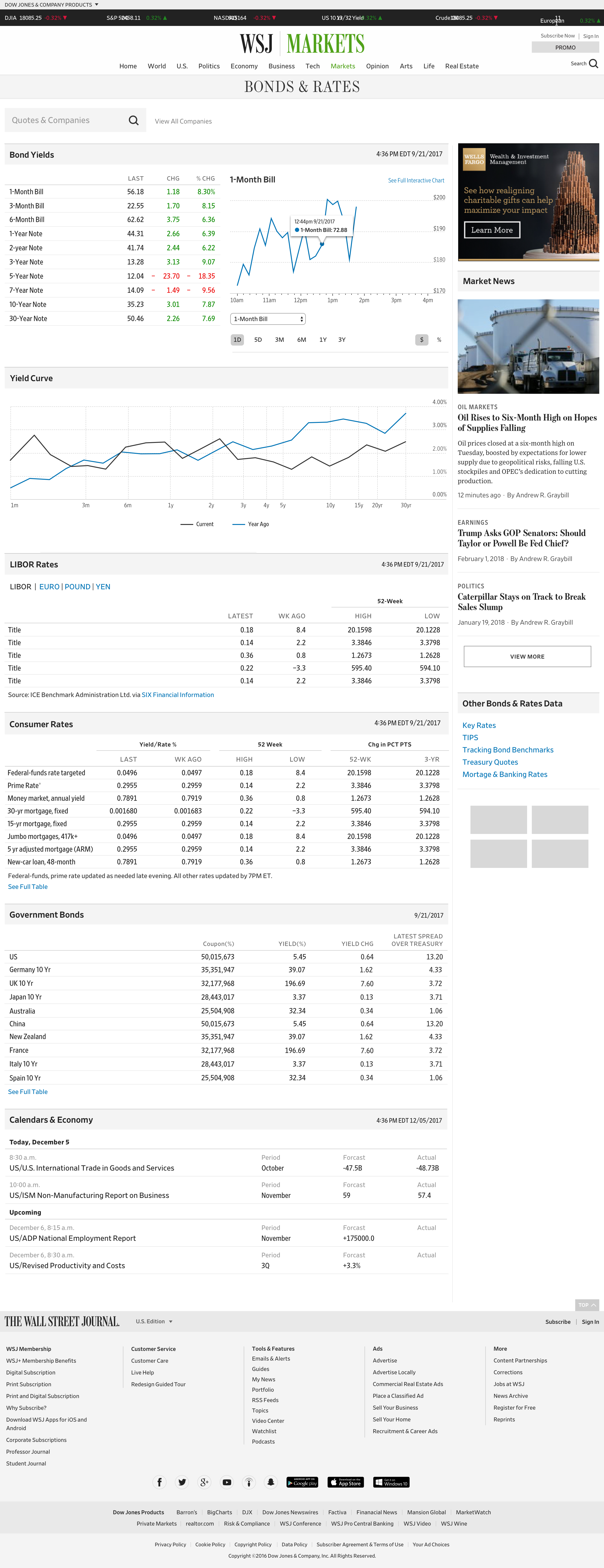
You can see for yourself how uncoordinated our tables and charts had grown to become.
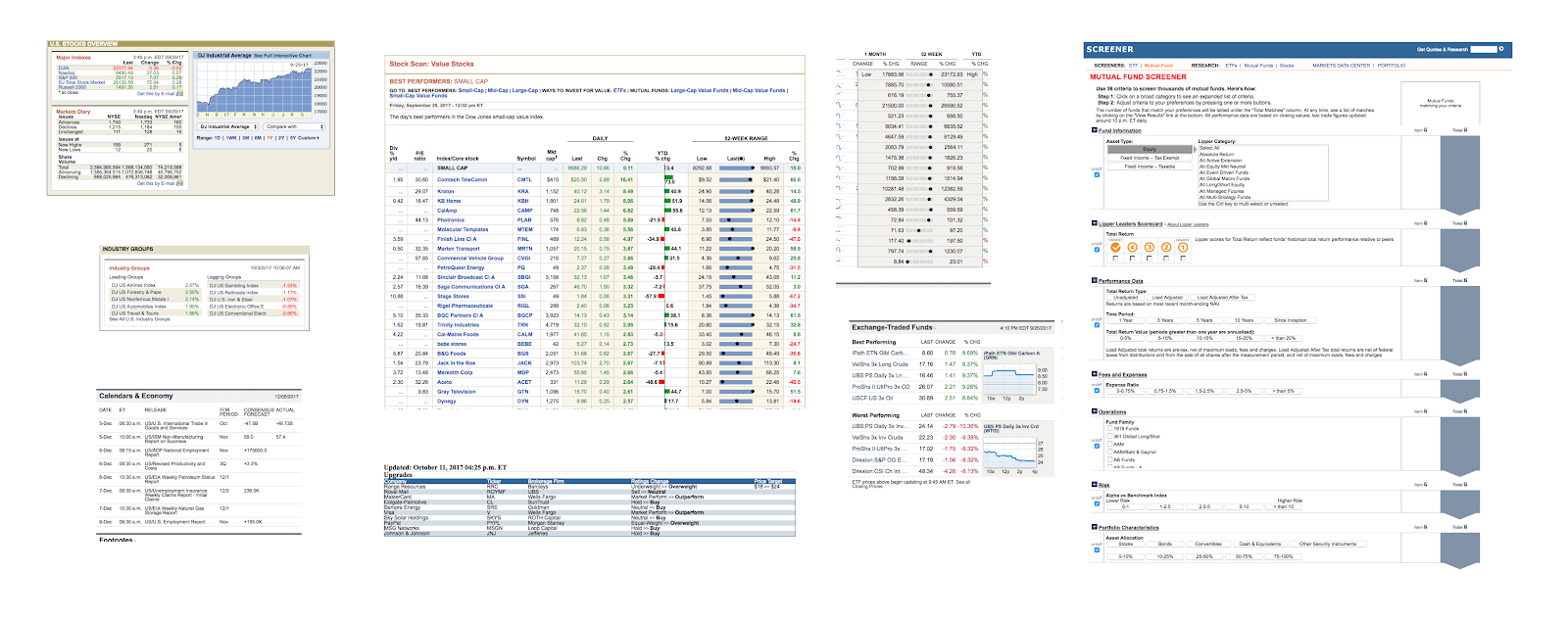
These were spread across dozens of pages, lost among navigational chaos. This is where the UX research work began. Who was using this data? How often? Did we have outdated tables which were no longer needed? Was there any data relevant to our readers we weren't providing? Our UX team diligently went about collecting answers from our subscribers.
As for interface design, I set two primary goals for the tables and charts: 1) that they maintained a strong visual coherence between them, and 2) they would look at home on any WSJ.com page they might be used. I began with the smallest elements and worked myself up into fuller compenents. For accessibility, I set the table text size to 16px and added as much margin I could get away with. We already had a color palette in our design system, which gave me proper guardrails.
What I ended up with was fully on-brand, felt consistent, and was flexible without being constraining. Before long, any new component needing designed was falling into shape without any new patterns or type treatments.
I also had the good fortune of spending some time with the designer of the Retina typeface, Tobias Frere-Jones. He assisted with some Retina-specific word-spacing, and he revealed hidden alternate figures such as a numerate negative symbol and a syntactical-descriptive colon drawn specifically for data like ours. Retina was designed for exactly this type of content, so it was extremely fun to dive into.
We now have a robust system for developing any table we need now or might need in the future.
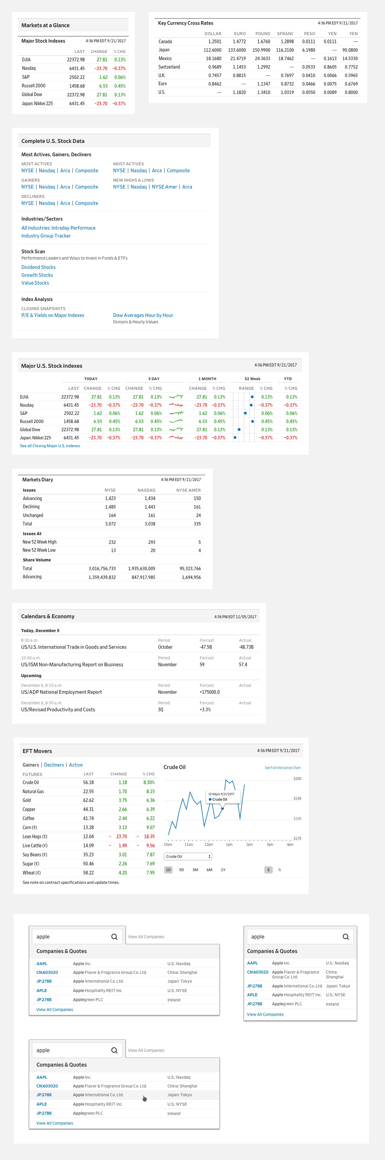
We structured the Market Data pages on the same 16 column grid we use across WSJ.com, including our 4 column right rail for secondary content. Keeping the right rail unchanged provided us with two benefits. We could use the same advertising slot sizing we already use elsewhere. And any new Market Data component we build would fit on any other page if we decided to do so; other pages like the Markets section front or Economy articles.
Once this structure was in place, the pages were easy to lay out. We took the learnings from the user research and listed out each and every table which belonged on the various pages.
More Views