Brian Feeney
1

The Future of AI and Machine Learning

There is a ton of chatter right now about artificial intelligence and machine learning. The tech behind it is advancing really quickly. People are wondering when, not if, it will replace human time and effort at accomplishing tasks. Particularly in the creative spaces: coding, image creation, technical and creative writing, etc.

I have a nagging sense this is a huge to-do about nothing. That AI & ML is this growing ball of yarn which seems to be encompassing everything, getting all mixed in to our lives, jobs, way of life. But then, if we take a wide step to the side, we'll see it's not as integrated into our lives as we thought. We could snip a single string and the whole thing falls away.

People will use AI to generate art for awhile until the look and style of those images runs out of novelty. Humans crave creative novelty. It's in our DNA to always be searching for the new and different. I foresee a decade or so of people finding ever more interesting ways to use AI imaging until ... we culturally decide, en masse, that it's time for a change.

We do this all time in every form of art. Push the envelope forward into new territory for awhile, then retreat to the familiar. Then push forward again. Then retreat. Like in music where the pendulum is forever swinging back and forth from high production to low, from expensive to democratic, from dance to bedroom, etc. Our exploration with AI is surely going to incorporate the same pattern. We'll have fun with it for a time, but then come to understand exactly where the human touch is missing. At which point, we'll prize human made art again.

In an article called The Age of Average, Alex Murrell writes about this phenomenon where every culture in the world essentially wants the same thing, on average, in their ideal art. "Despite soliciting the opinions of over 11,000 people, from 11 different countries, each of the paintings looked almost exactly the same," Murrell writes. He quotes the artist who did this research: "In nearly every country all people really wanted was a landscape with a few figures around, animals in the foreground, mainly blue."

I predict that we push and play with AI for a number of years — and having a good deal of fun and excitement with it — up until the point where every image it produces feels to us like the one billionth landscape with a few figures around, animals in the foreground, mainly blue. AI won't have made artists redundant. It will remind us why we always needed them to begin with.

In so much of what I read about AI, folks are forgetting that it's only a tool. There's a magic in it, but the magicians understand the tricks. Yes, most of us will be fooled for a long time, only a few people really understanding the technology behind it. Eventually, the magic will look more like science and take on the aura of normalcy. We'll get it. We'll outgrow it.

We're in the early days of experimentation. Tons of cool stuff is going to be made and will blow our minds. Lots of AI stuff will be amusing. Some of it will really help us perform better at our jobs. But, some of it will be poorly thought out, or indistinguishable from a dumb April Fools joke. Like this new Software as a Service called SyntheticUsers which purports to be a user research tool that doesn't have real users. Is it even real? Is it a joke? It doesn't matter which to me, because it's an obvious swing-and-a-miss at solving a real problem *, and so it's a joke either way.

What I'm pushing back on, I see now, is the hyperbole. Artificial intelligence will in fact change our lives. To what degree that's true is probably less than the chattering class is promising. I'd say on the level of the invention of plastics, and not so much the discovery of electricity. It's a new type of thing to keep our leftover pasta in. Not an entirely new way to absorb nutrients from food. I'm excited people are excited! But my expectations are tempered.

* For the non-tech folk reading this, I can explain the stupidity. The point of user research is to discover the unexpected ways real people misunderstand or misuse your products. You need living human beings to test this out. Any machine learning AI would only be reproducing common mistakes SyntheticUsers have fed to the algorithm. It will forever miss the wonderfully clever and stupid ways people behave. What you would learn from SyntheticUsers would not be how real people approach your software, but how AI approaches your software. It's so perfectly pointless, I have to assume it really is a joke.

April 05, 2023

articles


Breaking Figma Updates

I've been getting a lot of Figma library updates in my files which weren't triggered by human action. Neither I nor anyone on my team made updates to the libraries, but yet components show 'Updates' which must be accepted — or ignored forever until the end of time. What's causing this? Ghosts in the machine?

I have a guess. It has to do with failing to perfectly use Figma's every feature exactly as intended. Figma is far more technical a tool than they'd like to admit. If you want to use any of their smarter features, you're stepping outside of Design work and entering Engineering Land. The smallest error means your rocket might explode on its way to space.

Figma has a ton of great auto-layout and library features. They're great and they save time and reduce inconsistencies. The catch is that you have to use those features exactly how Figma wants you to. Figma expects you to have read and memorized every line of their documentation and watched every instructional video before you've added a single object to a file. If you start working without fully understanding what a Variant State or Mode is, or how a Hugged Content group with 8px of horizontal padding will behave when stretched, well, you're likely to have broken comps in the near future.

What breaks the comps? Figma updates.

One of my design system components which keeps getting these required ghost updates is my Tab Group. It's a component with an auto-layout group inside an auto-layout group inside an auto-layout group inside an auto-layout group inside an auto-layout group ... with a few variants. And this is a basic UI module. It's just a row of tabs. But multiple times now, this component has for unknown reasons been triggered to update, and after updating, options for it in my comps turn on and margins are broken, etc.

Here's what happened. Figma released an update which subtly changed the rules for which a 'hugged' group behaves when grouped with sibling auto-layout objects that's also inside an auto-layout group which has a variant. Or whatever. Something to that effect, something extremely specific. And it broke my component. The point is that their very explicit rules (likely not clearly written or documented) are so fine-tuned that there is zero curtesy afforded to the user. A component might accidentally be working how the user intended, yet when Figma updates their rules, the component which had been looking great is suddenly upside-down and backwards.

Engineers are used to this. It's a standard part of writing code. Code merges can sometimes have unintended consequences. This kind of thing now comes for designers. The smarter our design tools get, and the more they allow us to do with clever features, the more they're going to break in frustrating, time-consuming, comp-breaking ways.

Figma is great. Sketch is great. I'm really appreciative of both of these tools and how they help me do my job. My takeaway is that I need to focus on the comps I'm currently working on and care less about keeping old comps at 100% fidelity. Design for the current sprint. Design for the current quarter of backlog work. But once those designs are in production, accept that those old comps will slowly rot. Figma will break them as their app changes. Which is fine! Design work for software and the web is ephemeral. It's made easier with great tools, but those tools have no loyalty to you or to the integrity of your designs. They have an app to maintain, and if their updates break your old designs, that's not their concern.

So go ahead and accept those updates, comp-breaks and all. You're already onto the next thing anyway.

December 01, 2022

articles


How to Get Into Marvel Comics

A few years ago, I had a surprising revelation: I was a huge fan of the Marvel Cinematic Universe. Not just a casual enjoyer of a few of the films, but a real lover of what Kevin Feige had created with them. While the first phase of films were hit or miss, the quality significantly improved in phase two. The release of Guardians of the Galaxy in 2014 began a chain of near-perfect action movies, fun and wild and funny.

There are only so many movies, though, and I'm not that into rewatching them. I'm a fan, but maybe not a superfan. The obvious next thing to do was to go back to the source material. Who were these characters, originally? What were they like? I was really curious about the artists and writers who invented these stories, Jack Kirby and Stan Lee and their peers. The comics didn't just spring up out of nowhere. They existed in the real world. How did they fit into the early 1960s culture they were created in?

I was a comic reader for a few years at the start of the 90s, starting when I was 10. Unfortunately, the 90s were an infamously bad decade for the medium. That helps explain why I eventually gave up on them. New issues were lame. Back issues where hard to get hold of — or at least I didn't know how, or even that I should. I moved on to other things, leaving comics behind.

Now I've come back!

Comics aren't the easiest things to get into. Kinda what keeps them such a nerdy form of art. You gotta work at finding your way in. But I did it. And I want to help others who might want to try it, too. Here's my guide.

  1. Download the Marvel Unlimited iOS app. $10 a month is absolutely worth it, if you're gonna do the reading.
  2. Add these issues to your library:
  3. Start reading chronologically, adding each next issue to your library as you go.
  4. Read all of these titles through to the end of 1965, at least.
  5. Absolutely continue on with Fantastic Four, Spider-Man, X-Men, and Strange Tales. The others you can stop reading after 1965 if you want. They eventually get a little repetitive.
  6. Read The Fantastic Four all the way up to #102. It is undeniably the best comic of the decade. Sheer perfection of the medium. Incredibly, it continues to get better through to the end of Jack Kirby's involvement, which is issue #102. In fact, I'd say you could forget all the other comics and read only the first 102 Fantastic Four stories and nothing else. That would be perfectly OK. You'll be getting the best of the best.
  7. Doctor Strange stories are for a long time paired with another. Feel free to ignore the other half of those issues, and read only the Doctor Strange half.
  8. The X-Men jumps from #66 to #94, because #67-#93 were reprints. Issue #94 was the beginning of the long Claremont run, which is a big new start to the title. It's when Wolverine is permanently added to the mix, along with Storm and the other great next generation of characters. Colossus. Nightcrawler. You probably know them.
  9. After a while, you'll get the hang of Marvel Unlimited's terrible app UX, and learn how to browse it. You can start reading anything else that catches your attention. The Silver Surfer, Eternals, Young Avengers, Moon Knight. Black Panther. Tons more. If you've read this far, you'll have a good idea of what you like.

I'm still a newbie to comics. Is this the best way to read them? No idea. It worked for me!

One great reason to read all of these old comics is to play along in the MCU guessing game. Which heroes are going to get their own films/shows, and which will be make supporting appearances? How are the X-Men and the Fantastic Four going to be introduced? Which villains and story archs are they going to appropriate? It's a massive pool of options, and Feige has attempted to reach back to the origins as often as he can. The way he's fitted them all together in the MCU is a huge achievement. Over the next few years, the roster is going to double, then quadruple. A near infinite variety of possibilities.

The next phase of the MCU is going to be so much fun. Especially since Feige has embraced the camp that's integral to the characters. He is leaning into the weirdness and the zaniness, and running in the exact opposite direction of Fincher's Batman trilogy. "Dark" comics was a fad. I much prefer the playfulness and brightness inherit to the original 1960s art. There is an outstanding richness there that actually translates well to TV and film in the 21st century. It's absolutely worth digging in and finding that out for yourself.

August 24, 2020

articles


Feeeds

RSS is still with us. It remains a major backbone of the internet as we know it. I'd love to say RSS is going strong, but that feels a stretch. The truth is that RSS has been shouldered to the curb by the popularity of social networks which are fundamentally antagonistic to the open web. They took the promise of Real Simple Syndication, and trapped its essence inside little prisons. Walled gardens, we call them, generously. While most people are happy in their little boxes, thousands of us are out here publishing our own websites on the open web, with the freedom and experimentation of the early internet. This is something to celebrate.

RSS on the open web continues because it's useful, it's reliable, and enough of us care about it to keep it going. We love our websites, and RSS helps make us a community. RSS ties us together, and I want to build an app which breathes new life into those connections. An app which could make those ties stronger. An app which might return personal blogs and websites — even major news and magazine publications — back to an even playing field with Facebook and Twitter.

I think a way to do this is to take what makes major social networks easy to use, and apply that to an RSS reader. Normal people will never care about RSS. But we do. We care about our favorite writers, and our favorite publications. We care about RSS. We care about the open web.

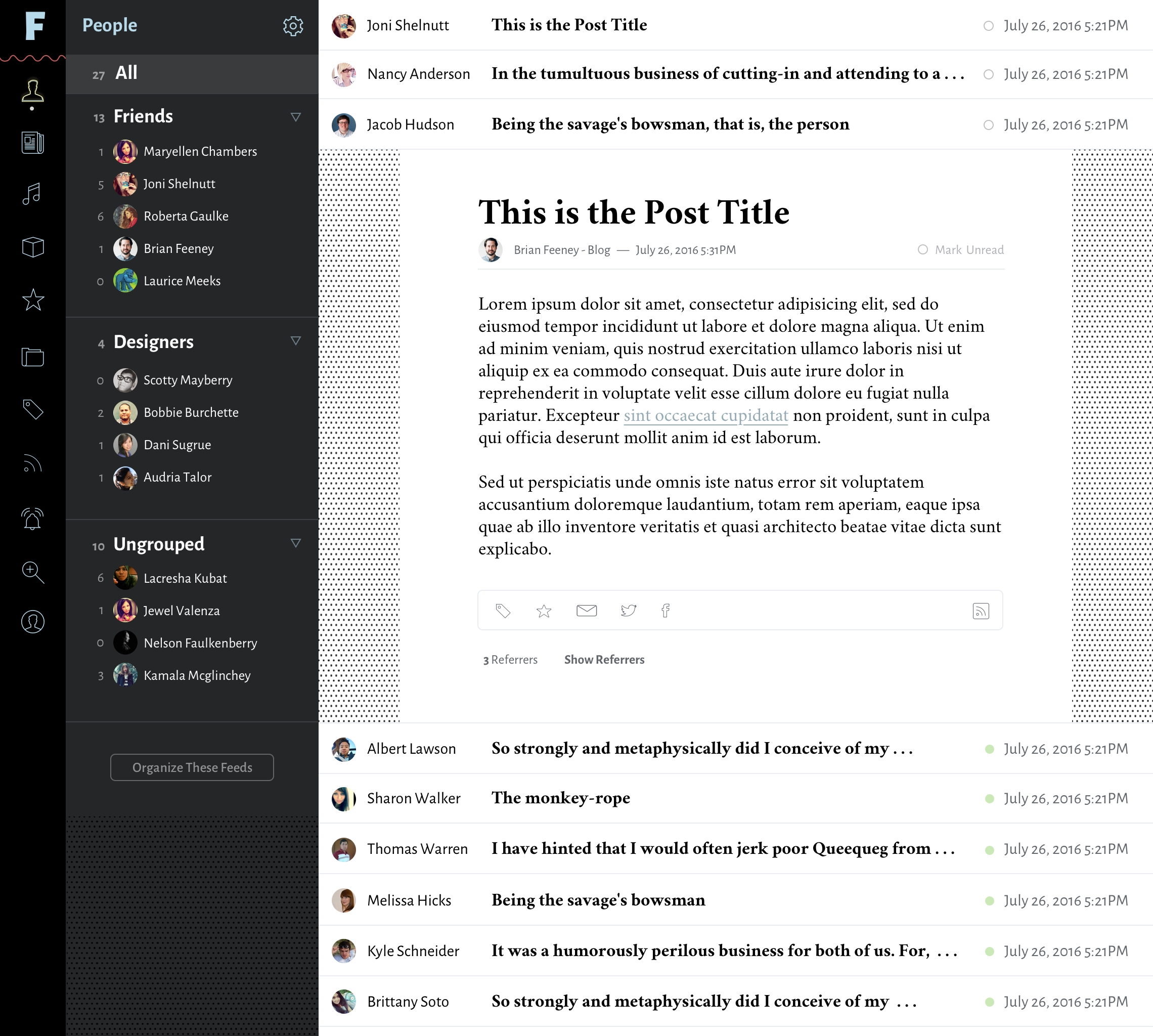
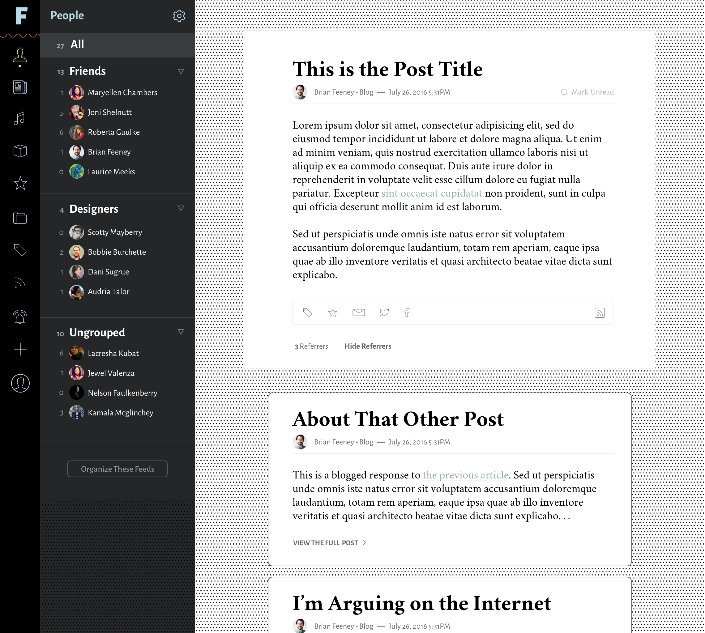
Feeeds prioritizes the people over the tech. It puts our names and faces on the surface. This is why I call Feeeds "a newsreader for writers." While RSS feeds are impersonal, the writing in those feeds are us. RSS is just plumbing, so we need a tool which humanizes that tech. We want to present faces and names instead of .xml and .rss files. Feeeds is that tool.

How It Works

The first step after signing into Feeeds is to attach your RSS feeds to that account. It might be one RSS feed. It might be five or more. Feeeds then offers two ways for your followers to access your RSS: either by viewing them in the reader view of the app, or by copying a bundled RSS feed and using that in the RSS reader of their choice.

How many readers have you lost over the years because you've changed your RSS feed location, or you started writing in a different blog or on another URL? The onus is on your readers to find any new RSS feeds you might have made. But, if your readers are using your up-to-date Feeeds feed, you can be sure you will always reach them. You won't have to rely on them finding your new RSS feed and adding it again to their RSS readers. They would be following you, not your RSS feeds directly. You.

Again, what Feeeds offers the open web, is a way for readers to follow people, to follow bloggers, authors, or journalists. If you have control over your RSS feeds, you can help your readers follow you better. They'll be connected to you, not your blog.

Are you a journalist who sometimes writes for multiple publications? Add the RSS feeds for your bylines to your Feeeds account. Be sure that your readers will always see what you publish, no matter which masthead it might be under. Do you run multiple blogs? Maybe one for personal use, one for your professional life, and others for side projects? Feeeds allows you one place to collect them, allowing others to find your scattered work easily. Perhaps they will find RSS feeds you produce they didn't even know existed.

Other Opportunities Feeeds Could Offer

Once all of these feeds exist in one place, tons of cool things can be done with them. So many great features could be built upon the vast array of RSS feeds inside the app.

  • Shareable bundles of feed groups
  • Monetization of feeds through paid access to untruncated feeds
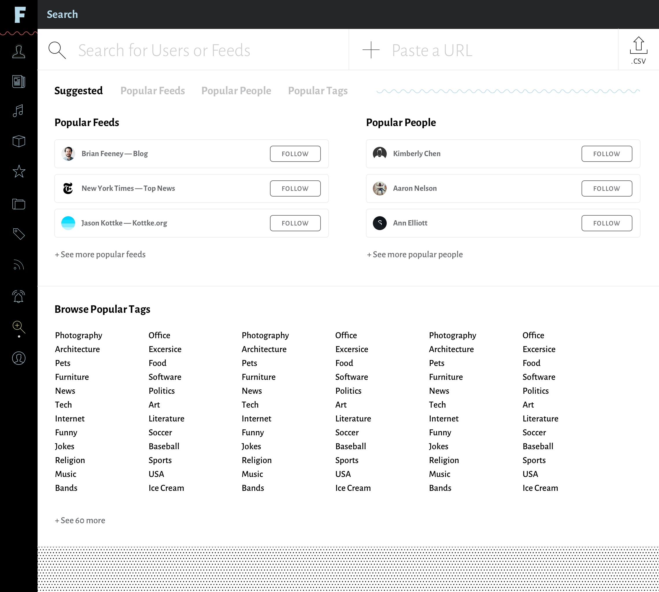
  • Better search of open-web blogs via categorization and tags. This would include recommendations, or integration with Twitter/Facebook/contacts to discover RSS feeds belonging to people you are following elsewhere.
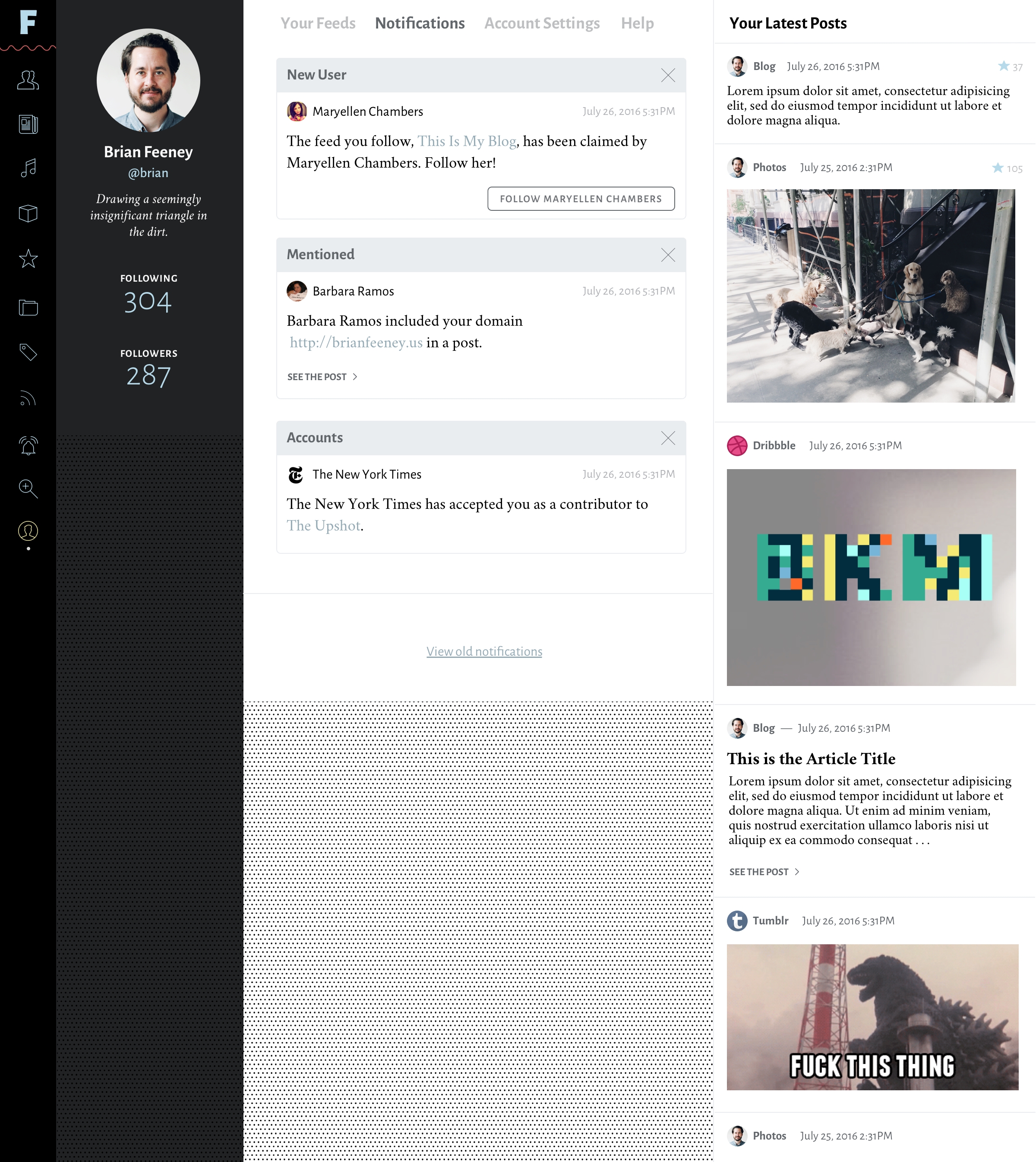
  • Auto-notifications for when your URL appears in another Feeeds RSS post. And tons more linking features on top of this.
  • Analytics for reader count, read count, "faved" posts, etc.

If you're interested, I have a giant Trello board full of ideas. https://trello.com/b/b4Q2HrY0/...

The Feeeds Newsreader

It would make sense for Feeeds to also be a newsreader itself. Once hundreds, thousands, or millions of feeds have been added to Feeeds, the most convenient place to read those feeds would be in that app. Newsreaders aren't highly complex applications, but, if designed well, they can open up tons of channels for discovery and curation. Users should be able to group their feeds by dozens of different categories: friends, family, publications, colleagues, industry, topics, etc.

The great thing about Feeeds is that it doesn't require any changes to RSS protocol, nor prescribes how anyone should run their own sites. It merely puts a more personal face to the technical nerdery that is RSS. And it's voluntary. You choose to put your feeds into Feeeds. Feeeds becomes an index of open web websites owned by people who want to be discovered, who want to be seen as a member of the open web community.

I've designed a Version 1.0.0 of the Feeeds app. I'll add a bunch of views below. But I don't have anyone to help me build it. If you're a developer and would love to work with me on this, please get in touch! If you know someone who might be interested in this project, please share this post! I'd love for Feeeds to become my full time job, but at this point, I'd be grateful if it were just a fun side project. I designed it six years ago. It's time for it to become a real thing!

August 18, 2020

articles


The Beholder's Share

“The beholders share”: the percent of work the viewer brings to a work of art, versus what the artist offers of themselves in making the art.

Design, as a craft, is finding pragmatic ways for taking on as much of the beholder’s share as necessary to bring about the desired outcome. To remove maximum uncertainty. Usually, this means creating designs which make life as easy as possible for the user.

A website should be usable even when a user is barely paying attention. Natural instincts should usually be enough. Buttons clearly defined and placed in logical positions. Navigation and content more or less exactly where people expect to find it. This is how a designer takes on more of the beholder’s share.

It’s not always in the users’ interest to move them through a flow as quickly as one could. There are times when a user should slow down and be required to pay more attention. Like when actions could result in deleted files or when important information needs to be entered into forms. In these cases, the user shouldn’t be made to feel frustrated at unintelligible UI, but to feel that the content they are confronting is worth considering more closely.

This is an area where design and content strategy overlap, where it’s impossible to draw a distinction between the two disciplines. There’s surely more to say about this, but right now, I’m going to let this simmer in my head. It might not be worth defining any further. More like an aspect of the craft of design which is best intuited.

April 19, 2018

articles


Music and Middle Age

I’ve had the same favorite band since I was 16. That’s not going to change. Now that I’m 34, that music is so packed with nostalgia and invested emotions it will forever be immensely important to me.

I never stopped digging for new music. My deep love for one band led me to a broad love for all. In the late 90’s, I spent hours every week inside record shops. In the early 2000’s, I lived inside whichever P2P network was popping at the time. Now it’s all streaming services; first Spotify, then Rdio, now the new Apple Music app.

I’ve mellowed in my middle age. I’m not desperately searching out the hip and the cool. My generation had it’s time in the musical spotlight during the 2000’s. The hip stuff now is for the kids. I patiently wait for the best stuff to filter to the top, without fearing I’m missing out on anything. When I was in my early twenties, it was important to know exactly where the edges were, what the shape and color of my generation’s art were. That’s all over for me. The kids now are making new shapes and new colors, exactly as they should be. It’s a beautiful cycle.

Does music even exist? Like really? We record the vibrations of sound, dig grooves in vinyl, align magnetic strips on tape, line up 1s and 0s on silicon and MP3 files. Can you really own those grooves? Can those magnetic strips or the 1s and 0s ever belong to you? I’ve concluded that no, no you can’t, no they don’t. You buy the objects which allow for the sound to happen, but the music exists somewhere else.

I used to obsess over my music collection. First with CDs, then with the MP3s in iTunes. Then Spotify. Then Rdio. At some point during all this I learned to let go. I’ve realized I can’t own any of that. Not really. All these collections and playlists have no permanence. They’re not mine. I can’t possess the music, but the music is there for me. Music is always within reach.

The best feature of the new Apple Music service is the curated playlists. They’ve hired actual people to make these, and the quality shows. Trusting in these playlists requires another act of letting go. My 22 year old self would never have accepted anyone else’s authority. I knew better. And any joker could see that the algorithms used for Artist Station radio on streaming services are laughably terrible. But these Apple Music curated playlists are nice. Admitting that has proven to me that I’ve grown up.

There’s even an Apple Music playlist that curates a collection of music that inspired my favorite band. I listened to it and I enjoyed it. They got it right. I could have grumbled about the song selection, even though the chosen artists are perfect. It’s fine. It doesn’t matter. I’ve made hundreds of playlists just like it. Others have made hundreds of thousands of playlists just like it. All that is well and good. Music is a conversation. For now whatever technology has the music in it, I can just press play, and there it is in the air, the music.

July 03, 2015

articles


Sam Potts vs. Robert Bringhurst

Sam Potts' article on Medium, A Refutation of The Elements of Typographic Style, was confrontational by intent. As a regular reader of TES, I was surprised to find that I agreed with him. Each time I pick up Bringhurst's book, I read it with the same admiration it has earned among my peers. As far as I knew, it had been universally loved and praised. But Potts takes an adversarial stance and makes excellent points about its lessons in typography. I won't paraphrase his refutations here. It's not a long article. If you're interested in this post, you should read his first. Mainly, the issues Potts takes up with Bringhurst have to do with calling out subjective points of view which had been written under the assumption of objectivity. If nothing else, it is worth reading for the new angle on a book most of us have read more than once and will likely read again.

A fact Potts almost alludes to, but never explicitly states, is that Robert Bringhurst is a poet. Bringhurst's writing is floral and full of pretty metaphors, and it takes a near-religious view of his subject. This is one reason type-lovers return to ETS over and over again. Bringhurst clearly sees the beauty in type, which is easy for a designer to sympathize with. No other writer covering typography gets close to the heights of Bringhurst's style.

Potts also shows that as a poet, Bringhurst would have had more editorial control over the appearance of his text than would any other type of writer. Poetry can take liberties with typographic and editorial rules which other forms of writing usually can't. And with poetry, the type treatment itself is often part of the art, whereas with other forms of writing the art is contained within the content of the text. This fact would fall in line with the liberties afforded a graphic designer, perhaps, but not so much the typesetter of a manuscript. It's an issue I happen to understand well. Most projects come with constraints which severely limit type selection, and therefore make it difficult to follow Bringhurst's rules as stated. We can't all be poets.

I'll continue to reread The Elements of Typographic Style. The issues which Potts takes with the book do not reduce it to uselessness. TES remains a beautiful book which shares in spirit my fascination with type and it's history. Not only that, but the many excellent glossaries at the back of the book are worth the price alone. As with any book of instruction or history, the text must be taken with a healthy amount of criticism. And Bringhurst himself gives the reader the right to disagree with him in the Forward, with a passage that has always been one of my favorites in the book:

By all means break the rules, and break them beautifully, deliberately, and well.

June 21, 2015

articles


The Magic Whip

Blur announced this morning that they're releasing a new album on April 27th, The Magic Whip. It's the record they recorded in China a few years ago which was supposedly left unfinished. Clearly it's been wrapped up. It's a wonderful little surprise for me and Blur fans everywhere.

My fascination with Blur goes deep. I know very well every second of every song, all the history, all the side-projects, and all the artwork. I've picked apart their songwriting process so intensely that I could probably list them in the order in which they were written. It's even clear to me when a track from Gorillaz fits chronologically between two songs from 13. I could tell you from intuition that Graham Coxon wrote and recorded You're So Great at the same time as his first solo record The Sky is Too High.

I believe it's important for designers to have at least one artist they know so well, whatever the medium. The creative process is demystified through understanding the relationship between the artist, their process, and history. You can see how good work gets made. Mostly a little all at a time. Sometimes all at once. But always as a result of effort.

Albarn keeps a fairly strict 9 to 5 schedule. He has a studio in London which he goes to everyday and he writes and records and works. It's why he's able to release something every year, and sometimes more often than that. When I first learned of his work ethic, mine was transformed. If I wanted to produce work as good as his, I knew I needed to work every day, like him. There's no waiting for inspiration, no lounging around being some kind of bohemian "creative." Design is a job. Music is a job. Art is a job. This year, Albarn will be releasing a new Blur album, a new Gorillaz record, and a new opera record. I aspire to ship so much great stuff with such regularity.

I also have a ton to say about the visual design for their records and how it relates to their music. Nearly all of their earlier album and single sleeves were brilliantly designed by the design studio Stylorouge. They're bright, bold, and colorful, often using pedestrian images to convey a homeyness, a comfortability, and echoes the variety of tone and breadth of style of Blur's music. They also speak directly to the Britishness of the band and their cultural roots, neatly placing them in a particular time and place. When you look at the spread of those covers, the impression given is that this is a band which knows precisely how to divvy up work and play, when to be serious, and when to take themselves lightly. It's a balance I've always tried to find for myself.

There's no doubt in my mind my love of Blur's music influences my design work. I'm attracted to graphic design with heavy flavor, bold choices, colorful execution, and attention to the tiniest details. This, to me, perfectly describes their music, as well. Endless variety. Endless fun. Serious work ethic. Always a wink and a nod towards "cool," but mostly following their instincts.

It really pays off to intensely study someone's work. It helps to see where inspiration comes from, how it transforms into new things. If you pick apart Blur's work, and you see all their influences (David Bowie, the Kinks, Scott Walker, the Who, Julian Cope, etc.), you can see where elements were lifted, combined, reused, transformed, reinterpreted. Art as a job starts to make more sense. We don't exist in a vacuum, and we don't create anything out of thin air.

When I heard that a new Blur record is coming out, my excitement isn't only over getting to hear new music from some of my favorite musicians. It's also for the opportunity to pull it apart and see how it relates to their previous work, to see how it compares to other music released lately, to sniff out new influences in the music I hadn't heard before. I'm excited to get to work.

February 19, 2015

articles


Brooklyn Beta 2014

As an attendee to the fifth and final Brooklyn Beta, I feel I owe myself a blog post on the experience. I didn’t take any notes while there, though. For that I’ll point you towards Erica Heinz's post, which seems wonderfully complete. The talks were all good, some were great, and a couple will stay with me for a long while.

As this was my second year, I feel I have a better handle on what made the conference so great. It’s the motto: “Make something you love.” Chris and Cameron filled the rooms of BB with people who love making things on the Internet. And that simple fact created an atmosphere full of fun, inspiration, and comraderie.

Those of us who love making things for the Internet, we’re a different kind of people, it turns out. We’re a legit tribe. We encourage people to talk about their passions, and then we encourage them to make them happen. We’re people who love to make things and love to hear about what other people are making. Not everyone is like this. And not everyone needs to be, of course. But BB brought these types of people together. Being one of them, I found it a wonderful experience.

In the week post-Beta, I ended up in two situations where I was among large groups of friends and acquaintances. There was plenty of fun and good-time-vibes, but even so they were missing that stange BB spark. They were missing that central love of making things for the Internet.

I’m an introvert in my core. But it was somehow very refreshing to have conversation after conversation with friends and strangers for three whole days without really wearing down. Why? I can’t really say, except to guess it has something to do with the shared curiosity and enthusiasm at the conference. Maybe I’m not really an introvert through and through. Maybe I feel energized when I’m able to talk freely about making things. I love hearing what people are designing and building and dreaming about one day creating. It’s so much fun.

So there won’t be another Brooklyn Beta, but I really hope something fills the void it left. Maybe all I need to do is keep in touch with the people I met there and keep those conversations going. They’re going to keep building and making things whether or not there’s a yearly conference to attend. I want to keep up with them. I want to encourage them. And I want them to encourage me. I want all these good Brooklyn Beta vibes to keep vibing.

October 26, 2014

articles


The Quieting

Over a year ago, I turned off all notifications and emails for likes, hearts, and stars. Instantly, the noise of the Internet faded away. No more nagging, staticky buzz. The internet went quiet. All the things I’m interested in are still there, but they don’t come at me anymore. They wait. It’s great.

We’re stuck in a rut with social media. Conformity and habit have aligned so many websites to walk the same paths. It’s the natural entropic state of nature, I suppose, to always be adding more diversity and noise and fragmentation. Ding Ding Ding DING DING DING DING. I guess we have all these Like buttons because we enjoy the endorphin-triggering affect of micro-praise, but we lived without it before and we can do without it again. I prefer life without them.

I am really interested in seeing the Internet take a giant step back to 2005, back before Facebook and Twitter and when blogs were the thing. In those days you couldn't respond by clicking an icon. You had to wither comment on their site or write your own post and send them a link. That was nicer.

There’s a lot of chatter out there that blogs might see a little more sunlight soon. Maybe that might happen. Big Blue and the Tweet Machine aren’t going away, but a lot of us are definitely ready to move on to something else. Why not back to blogs? There was nothing wrong with them. RSS still works beautifully. Personal webpages allow for so much more diversity, uniqueness, and originality. Ideas and conversations move slower and more deliberately with blogs. And they never really went away, anyway.

Count me in for Team Blog. Don’t Star this. Write about it.

September 29, 2014

articles


9035