Brian Feeney
1

Journaling and Blogging

For the last few years, I've written a lot in a personal journal. The journal alternates between private and public-worthy content, and I find it very hard to pull out what should be published at this site and what shouldn't. It's a design problem I want to solve. I want one place to write which allows me to push to public view if I choose. 

There aren't any apps or CMS's out there at the moment which do exactly what I want. So I've been designing my own. How I build it is another question, but I'm enjoying playing with the constraints and the possibilities. 

What I've come up with is a combination of an iOS note taking app and dropbox-hosted static site CMS. The hope is to construct something which is very easy to set up and use, and reduces as much friction as possible. 

I'm designing something for myself. And maybe I'll build it for myself. Shipping something along these lines is a goal for 2016, and I'll try and document my progress here.

December 19, 2015

blog


July 25, 2015

blog


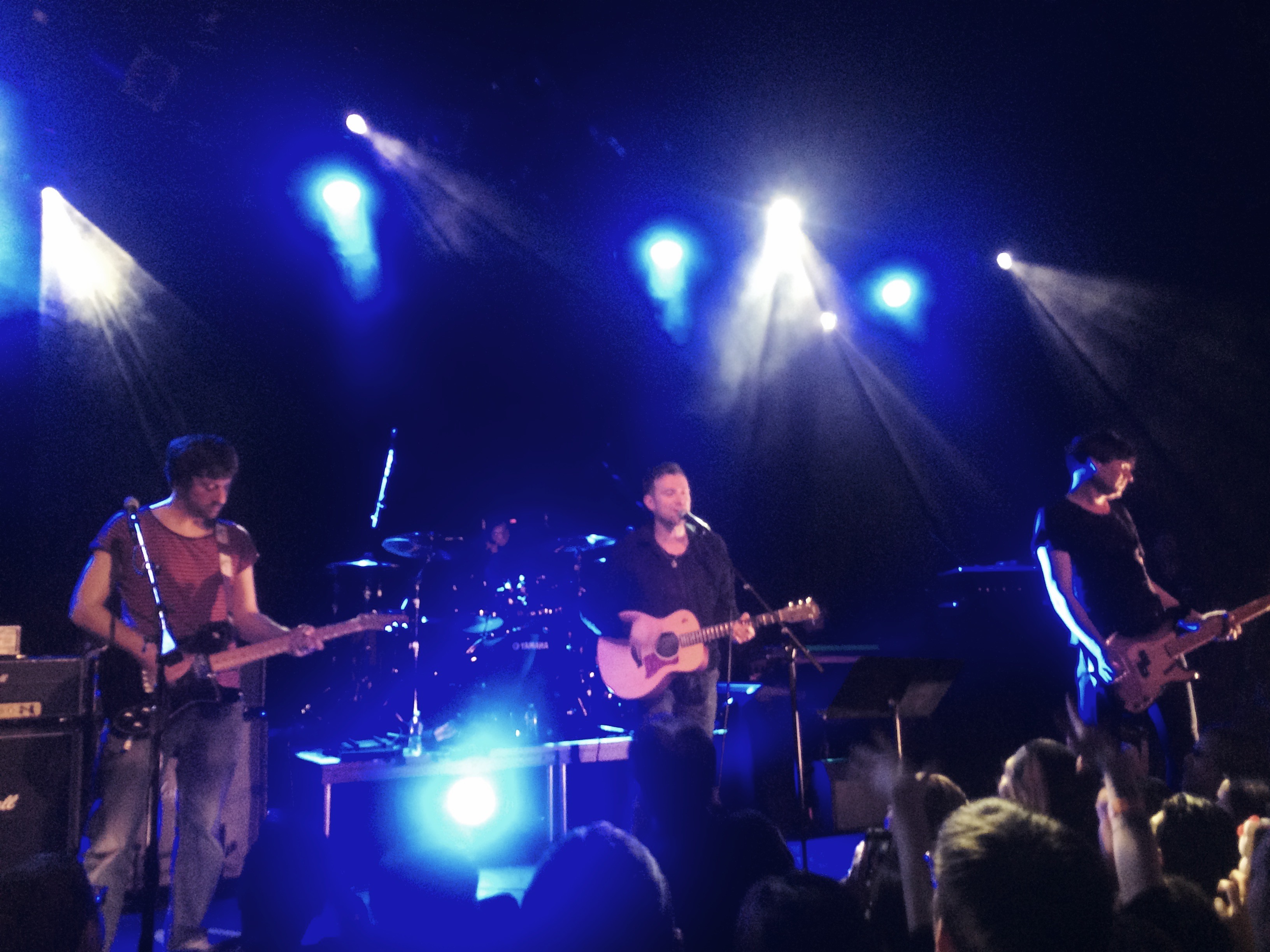
Blur at Music Hall of Williamsburg

Absolutely incredible to see Blur up close and personal. They played through new album The Magic Whip, plus a few songs in an encore. Trouble in the Message Center was so rocking.

May 01, 2015

blog


Darkroom

darkroom-presskit-16x9-3screens.jpg#asse

Yesterday, Matt Brown and Majd Taby released their new app, Darkroom. It's a remarkable new standard in the photo-editing app category, completely deserving of all the praise it's been getting. Both Matt and Majd are photo lovers and Darkroom shows it. They've built a tool that lets you get inside your photos and photo library in all the ways you wish you could on your phone. And quickly. And easily. And beautifully. I love this app.

For well over a year, I was a heavy user of VSCO Cam. In order for Darkroom to become my default photo-editor, it really needed to do everything better. Or at least just as well. When I heard Brown was working on a photo-editing app, my first thought was, "Shit." What if it's terrible. (Brown is an old friend.) But I'm happy to say that since using Darkroom (I was a beta tester), I've barely opened VSCO at all. Darkroom is simply better. Granted, it's missing all the great filters VSCO has wonderfully curated, but in Darkroom, you can make your own. You could even spend a little time copying the look of your favorite VSCO filters if you were so inclined. I did for a couple, and I'll probably copy a few more. In any case, it can't be long until I reach full filter saturation. How many do you need, really?

One of the things I missed from VSCO Cam was the imported photos feature. For me, it acted as a To Edit Later list, a place to keep all my better images and save them for another day. Turns out there's a great work around in Darkroom, and it's even better for a couple important reasons. The iOS Photos app lets you mark your favorite photos with a click of a heart icon, which are then collected in a Favorite folder. Darkroom gives you access to all your different Photos folders, which means without any fuss I can quickly jump into Favorites and start editing from there. And because I'm not importing images into the app, the app itself isn't growing in size, which was a big problem with VSCO Cam. Right at this moment, on my phone, VSCO is at 313MB in size. Darkroom is 6.1MB. Darkroom wins.

Aside from custom filter creation, the other big selling point for Darkroom is its Curves feature, which you can purchase for $2.99 (the app itself is free), and it's awesome. It's handsomely designed for touch, allowing you to run quickly through each curve and end up with a nicely tuned image at the finish. There will be other features for sale soon, which will add even more functionality to an already great app.

My iPhone is the camera I use the most because it's the camera I always have with me. Apps like Darkroom makes it even better.
February 13, 2015

blog


Cushioning

Though I'm employed full time by the Brooklyn Museum, I also take freelance work. I do this for a few different reasons. 1) The extra income. 2) For keeping both my design and development skills in practice. 3) To help out friends. 4) Because I love making things .

Because of number 4, I say yes to just about anything that comes my way. This sometimes becomes a problem because I tend to make terrible assumptions about my time. Namely, how much of it I actually have to work. 

This is one of the reasons Jonnie Hallman has created Cushion. It's a web app with two very meaningful purposes. One is for tracking your income as a freelancer, making sure you have enough work scheduled to be financially stable. The other is to help make intelligent decisions about scheduling the work so that you're not doing too much at once. 

Since I have already have a sustaining salary, the income tracking feature is only a nice-to-have for me. It's great to see in one glance, though, and if I ever did go fully freelance, it would immediately become a need-to-have feature. But the scheduling view -- that is a feature which really pulls its weight for me.

Two things Cushion has shown me so far:

1) I did a pretty good job scheduling my freelance work in 2014:

Screen-Shot-2014-11-20-at-5.16.40-PM.png

2) 2015 is starting to look a little top-heavy.

Screen-Shot-2014-11-20-at-5.27.47-PM.png

I'm really glad to have seen this displayed so clearly. Seeing my time commitments in this way makes me feel empowered. I have a better grasp on how much work I can handle and what kind of promises I can and cannot make to current and future clients. This was definitely worth the cost of joining the paid beta.

There's a paid beta. If you're a freelancer, I'm already prepared to say that Cushion is worth it. And Jonnie is a good dude. Much respect for building a great, very useful thing.

November 20, 2014

blog


Monument Valley

I've only played a handful of iOS games. While many are fun and well designed, Monument Valley is by far the most beautiful. It's especially engrossing on the iPad. I fall right into it. That's not even mentioning how much fun it is. Great little mind-bending puzzles all over the place. I highly recommend it. The second set of stages was released yesterday, as an in-app purchase. 

November 13, 2014

blog


Blogging for the Brooklyn Museum

My first post for the Brooklyn Museum Tech blog went up October 20th: The Design Spin Cycle. In it, I tried to explain what it's like jumping into a huge project which had already gained strong momentum with respect to research and purpose, but hadn't yet found it's shape. We knew the goal for what we would eventually build, but we didn't yet know what we would end up building. I also tried to hint at how much I'm designing -- as in, the size and scope of it all. There are a lot of different pieces, some much larger than others, some public facing while others are for internal use, and I'm trying to be very deliberate about how I'm approaching it all at once. I'm very aware of being the sole designer on the project, and I want to be sure my design process includes the rest of the team as much as possible. 

I might repost it at brianfeeney.us at some point, either in this blog or some other page for posterity.

November 03, 2014

blog


Plain Reminders

Mandy Brown, from her recent newsletter:

[The] repository of the world’s knowledge has ever been too large for most people to know it completely, and it keeps getting bigger. In that context, choosing to surface history that is technically available but obscured by the sheer enormity of human experience is a kind of radical act. Maybe what we need are not writers who can tell us something new, but those who can plainly remind us of everything we failed to remember.

And she's absolutely right. In the last few hundred years, we've amassed an unfathomable amount of knowledge and wisdom. Finding our way through that is a herculean task, and it's not something our education system is prepared to tackle either. Perhaps a new generation of journalism could be? 

I've long had the feeling that the pendulum-like swing of philosophy has also slowed to an almost full stop. From what I can tell, we've tested all the extremes -- Existentialism to materialism, authoritarianism to totalitarianism, romanticism to realism, etc. -- and are now doing our best to be pragmatic with what we've learned. It's still difficult to make sense of it all, though, without Master's degrees or years of sacrificial reading. There's too much to know and it all requires so much context to understand properly. 

I suppose longer-form journalism has always been a kind of continuing education. It would be nice to push this kind of writing into the foreground. If this is what Brown is proposing, I'm all for it. 

November 03, 2014

blog


Just Keep Writing

Finally got into the flow of writing posts again. Part of it is the app, Writer Pro. It’s exactly the app I had slowly been conceiving of in my mind, and was *this close* to designing and possibly prototyping. Still, might, actually: if I’m going to try my hand (and my brother’s) at designing an app, there’s no better place to start than a text editor.

Writer Pro allows you to take notes and leave them in a notes folder. When you’re ready to actually start expanding that note into something more like *writing*, you move it into the Write folder. And then from Write to Edit, and from Edit to Read (where Read is really Ready To Publish). It’s great to be able to keep that flow within one app. I’ve needed to use so many apps to accomplish this previously. I take notes in either Vesper or Notes. I use Notes for longer writing. And at some vague point, those writing drafts move into my CMS, but once there it’s so hard to decide if they’re ever finished or not.

Let’s poor one out for Editorially. It closed in the Spring, but it was well on it’s way to solving writing for the web. If it had lasted long enough to have produced an iOS app, I likely never would have thought to look for another place to write. It was so good.

I’ll continue to journal using a .txt file in Notes, stored in Dropbox. Some of thoughts I stumble upon in that free-form writing become posts for the blog, likely skipping the entire Notes to Drafts to Final process. And I hope to get to a place again where I could write blog posts on the fly. Regardless of how this writing gets done, it’s always worth doing. This year’s journal is up to 22,000+ words. And that feels too short. 

September 04, 2014

blog


Development Is Design

I attended Brooklyn Beta last week. While there, I must have introduced myself a hundred times, which of course required me to explain what I do. My stock answer was that I was a designer and developer. Both. And each time it felt weird, as if I was either claiming to be a wunderkind who can do it all, or that I didn’t know the difference between the two enough to pick one.

So when Brad Frost makes the argument that development is design, I nod my head in agreement. I know why we generally think of them as separate, it's just that it is becoming increasingly difficult to define where design ends and development begins. Some front-end work is only translation from comp to code, as in how it looks, but so much more involves how a site works. So much gray area in there.

And so now, when people ask, I’ll just say I’m a designer.

October 14, 2013

blog


364