Lake Awosting
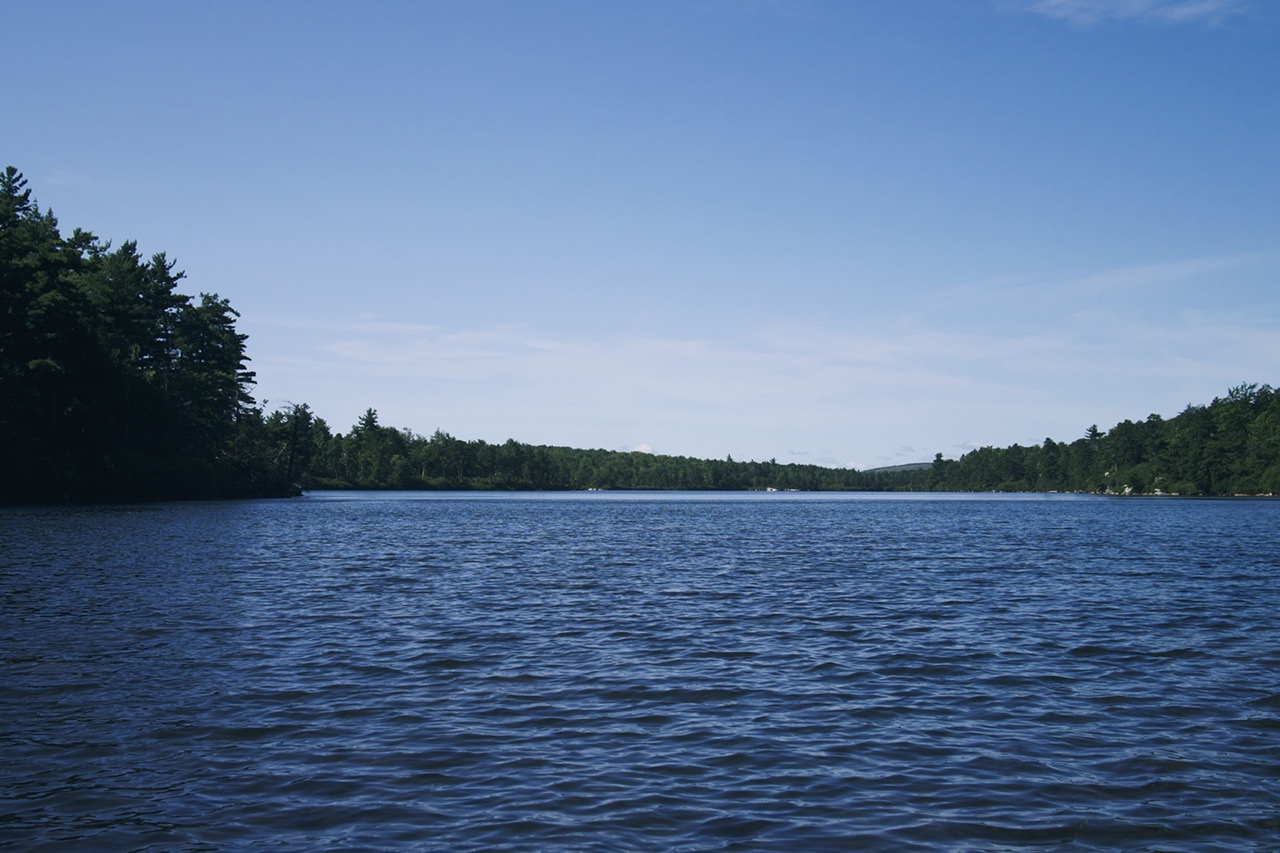
We escaped NYC for the third time this summer. Another trip into the woods.

We escaped NYC for the third time this summer. Another trip into the woods.

A few years ago, I had a surprising revelation: I was a huge fan of the Marvel Cinematic Universe. Not just a casual enjoyer of a few of the films, but a real lover of what Kevin Feige had created with them. While the first phase of films were hit or miss, the quality significantly improved in phase two. The release of Guardians of the Galaxy in 2014 began a chain of near-perfect action movies, fun and wild and funny.
There are only so many movies, though, and I'm not that into rewatching them. I'm a fan, but maybe not a superfan. The obvious next thing to do was to go back to the source material. Who were these characters, originally? What were they like? I was really curious about the artists and writers who invented these stories, Jack Kirby and Stan Lee and their peers. The comics didn't just spring up out of nowhere. They existed in the real world. How did they fit into the early 1960s culture they were created in?
I was a comic reader for a few years at the start of the 90s, starting when I was 10. Unfortunately, the 90s were an infamously bad decade for the medium. That helps explain why I eventually gave up on them. New issues were lame. Back issues where hard to get hold of — or at least I didn't know how, or even that I should. I moved on to other things, leaving comics behind.
Now I've come back!
Comics aren't the easiest things to get into. Kinda what keeps them such a nerdy form of art. You gotta work at finding your way in. But I did it. And I want to help others who might want to try it, too. Here's my guide.
I'm still a newbie to comics. Is this the best way to read them? No idea. It worked for me!
One great reason to read all of these old comics is to play along in the MCU guessing game. Which heroes are going to get their own films/shows, and which will be make supporting appearances? How are the X-Men and the Fantastic Four going to be introduced? Which villains and story archs are they going to appropriate? It's a massive pool of options, and Feige has attempted to reach back to the origins as often as he can. The way he's fitted them all together in the MCU is a huge achievement. Over the next few years, the roster is going to double, then quadruple. A near infinite variety of possibilities.
The next phase of the MCU is going to be so much fun. Especially since Feige has embraced the camp that's integral to the characters. He is leaning into the weirdness and the zaniness, and running in the exact opposite direction of Fincher's Batman trilogy. "Dark" comics was a fad. I much prefer the playfulness and brightness inherit to the original 1960s art. There is an outstanding richness there that actually translates well to TV and film in the 21st century. It's absolutely worth digging in and finding that out for yourself.
History says, Don’t hope
On this side of the grave.
But then, once in a lifetime
The longed-for tidal wave
Of justice can rise up,
And hope and history rhyme.
So hope for a great sea-change
On the far side of revenge.
Believe that a further shore
Is reachable from here.
Believe in miracles
And cures and healing wells.
Relieve your body and your soul.
— Seamus Heaney
Obviously genius idea by Robin Rendle:
[W]hy do we have to wait 4 years for a moment like this? The Democrats should hold an event like this every single year; educating the public about the state of Senate and House races, about the Democratic legislative agenda, about what was accomplished over the past year, and how to make this country a more just place.
It would be an E3 or Nintendo Direct or an Apple keynote but far, far more important. No celebrities, no propaganda. But just like this: talking about empathy, discussing how to fix the economy
We desperately need more celebratory events for our country to rally around. More days for sharing our goodness, kindness, and caring. More opportunities to exhibit on a national stage the fruitful outcomes of successful liberal and progress policies. The Democratic Party would do so well to institute things like this.
Marissa Christy had some smart thoughts on how design systems can fail (way back in 2018).
A project can go awry for a number of reasons — budget, resources, time, mismanagement — even turnover. But even successful design systems with organizational buy-in can fail. The pitfalls I am about to highlight feel inherent to the very idea of a design system, even in the most ideal of scenarios.
The entire article is worth your time. I felt a particularly strong resonance with these paragraphs:
When the timeline for implementation gets spread out over multiple months (and more likely, quarters or years), a lot can change. And from an implementation standpoint, front-end development is changing more quickly than ever before. The past few years have seen paradigms shift from utility-like reusable classes (think .margin-sm) to BEM syntax, from monolithic sass outputs to scoped styles within React components. And as the CSS spec adds more and more functionality, from grids to variables, the future is far from fixed.
I’ve seen several implementations of style guides fail because they simply couldn’t keep up with the front end. Bloated bootstrap-like files when everyone is worried about performance. A ruby gem at the moment that node was taking off. And even though React seems almost designed for componentized design systems, the changing nature of tech makes the whole notion of creating a permanent, forever system unlikely.”
It's important to remember that a Design System is a tool. It helps you build your product faster and more coherently. But, like everything else having to do with the internet, it's a tool with eventually diminishing usefulness. The more you keep that top of mind, the better off you'll be when it comes time to start over. At some point, _you will need to start over_. That's the straight truth of building software.
I've been thinking a lot about which kind of design system is better: A design system tightly entwining design and code documentation? Or a DS which is just design, agnostic to the code framework used? I lean towards the former: it provides the most immediate beneficial returns; but it requires constant maintenance and dedication to one framework. The later is great because it can outlast any one framework, but it doesn't save engineers much time.
There are clear cut trade-offs for either path you choose. But you have to choose one. You can't have both. And, eventually, either will fail. So it goes.
Matt Web has some thoughts on RSS which perfectly mirror my own:
It would be a good thing if RSS were more popular. When RSS is popular, it shifts the balance of power away from the social media platforms, which means that it doesn’t feed their ad targeting engines, or move people towards extremism. Plus it’s a less hectic, more egalitarian way to read.
BUT, the user experience around RSS has some sharp edges, and there are missing pieces that mean that RSS is unlikely to return to the mainstream. A corporate-owned platform could fix these missing pieces; it’s harder for RSS with its decentralised model.
I believe my app Feeeds could solve every problem with RSS Matt mentions: onboarding, newsletters, monetization, and discovery. And tons more. And it could do so without changing any of the infrastructure around RSS, nor force any required adoption of the app. Feeeds would be a voluntary tool, never requiring any site owner to change either code or design of their own websites. It's a community hub one opts into.

RSS is still with us. It remains a major backbone of the internet as we know it. I'd love to say RSS is going strong, but that feels a stretch. The truth is that RSS has been shouldered to the curb by the popularity of social networks which are fundamentally antagonistic to the open web. They took the promise of Real Simple Syndication, and trapped its essence inside little prisons. Walled gardens, we call them, generously. While most people are happy in their little boxes, thousands of us are out here publishing our own websites on the open web, with the freedom and experimentation of the early internet. This is something to celebrate.
RSS on the open web continues because it's useful, it's reliable, and enough of us care about it to keep it going. We love our websites, and RSS helps make us a community. RSS ties us together, and I want to build an app which breathes new life into those connections. An app which could make those ties stronger. An app which might return personal blogs and websites — even major news and magazine publications — back to an even playing field with Facebook and Twitter.
I think a way to do this is to take what makes major social networks easy to use, and apply that to an RSS reader. Normal people will never care about RSS. But we do. We care about our favorite writers, and our favorite publications. We care about RSS. We care about the open web.
Feeeds prioritizes the people over the tech. It puts our names and faces on the surface. This is why I call Feeeds "a newsreader for writers." While RSS feeds are impersonal, the writing in those feeds are us. RSS is just plumbing, so we need a tool which humanizes that tech. We want to present faces and names instead of .xml and .rss files. Feeeds is that tool.
The first step after signing into Feeeds is to attach your RSS feeds to that account. It might be one RSS feed. It might be five or more. Feeeds then offers two ways for your followers to access your RSS: either by viewing them in the reader view of the app, or by copying a bundled RSS feed and using that in the RSS reader of their choice.
How many readers have you lost over the years because you've changed your RSS feed location, or you started writing in a different blog or on another URL? The onus is on your readers to find any new RSS feeds you might have made. But, if your readers are using your up-to-date Feeeds feed, you can be sure you will always reach them. You won't have to rely on them finding your new RSS feed and adding it again to their RSS readers. They would be following you, not your RSS feeds directly. You.
Again, what Feeeds offers the open web, is a way for readers to follow people, to follow bloggers, authors, or journalists. If you have control over your RSS feeds, you can help your readers follow you better. They'll be connected to you, not your blog.
Are you a journalist who sometimes writes for multiple publications? Add the RSS feeds for your bylines to your Feeeds account. Be sure that your readers will always see what you publish, no matter which masthead it might be under. Do you run multiple blogs? Maybe one for personal use, one for your professional life, and others for side projects? Feeeds allows you one place to collect them, allowing others to find your scattered work easily. Perhaps they will find RSS feeds you produce they didn't even know existed.
Once all of these feeds exist in one place, tons of cool things can be done with them. So many great features could be built upon the vast array of RSS feeds inside the app.
If you're interested, I have a giant Trello board full of ideas. https://trello.com/b/b4Q2HrY0/...
It would make sense for Feeeds to also be a newsreader itself. Once hundreds, thousands, or millions of feeds have been added to Feeeds, the most convenient place to read those feeds would be in that app. Newsreaders aren't highly complex applications, but, if designed well, they can open up tons of channels for discovery and curation. Users should be able to group their feeds by dozens of different categories: friends, family, publications, colleagues, industry, topics, etc.
The great thing about Feeeds is that it doesn't require any changes to RSS protocol, nor prescribes how anyone should run their own sites. It merely puts a more personal face to the technical nerdery that is RSS. And it's voluntary. You choose to put your feeds into Feeeds. Feeeds becomes an index of open web websites owned by people who want to be discovered, who want to be seen as a member of the open web community.
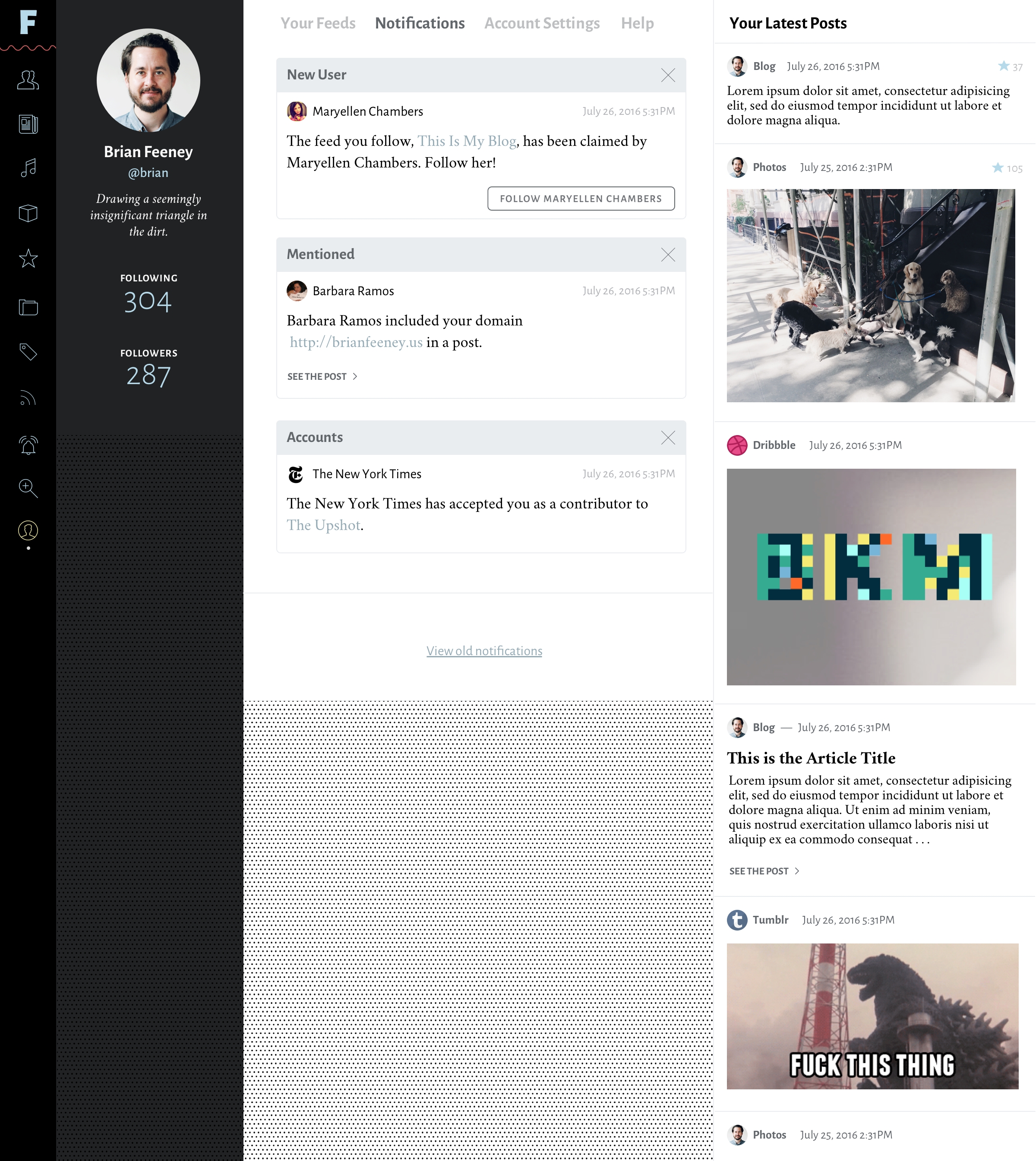
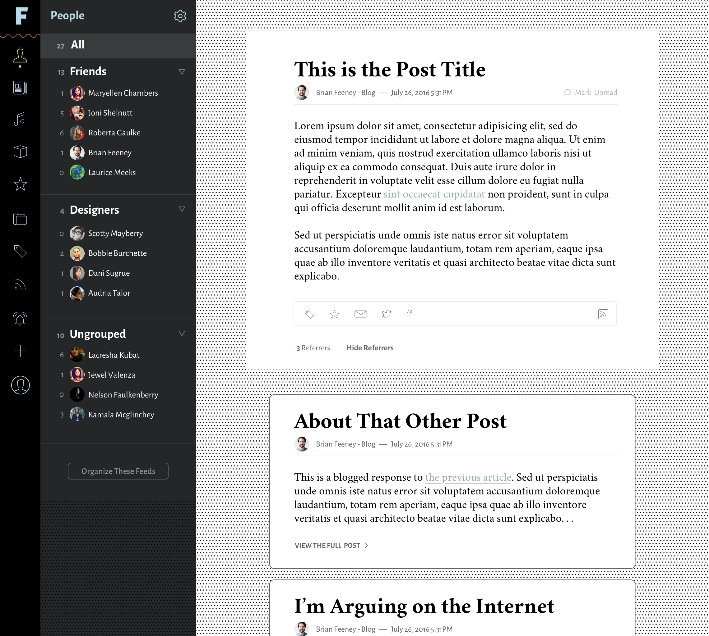
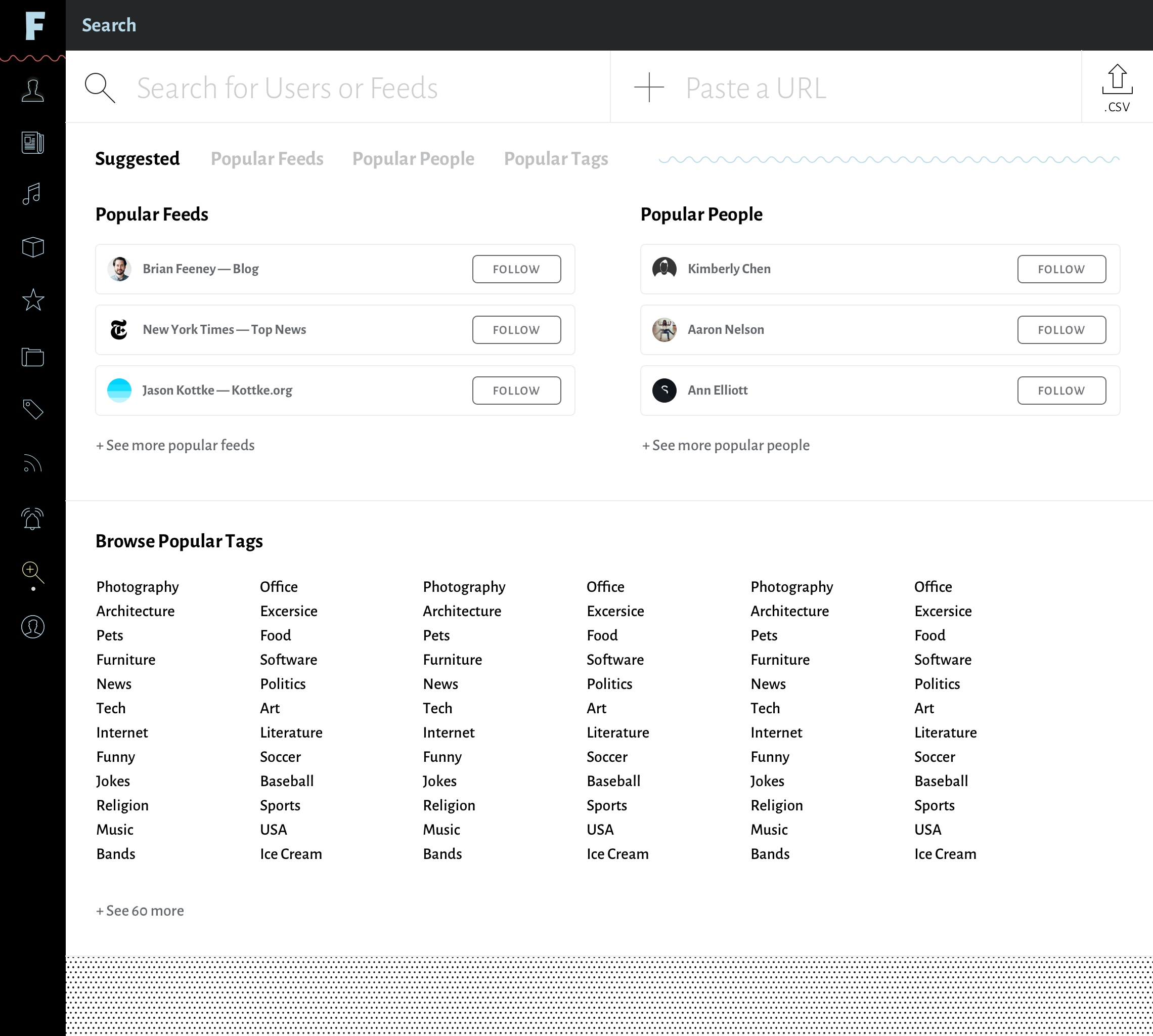
I've designed a Version 1.0.0 of the Feeeds app. I'll add a bunch of views below. But I don't have anyone to help me build it. If you're a developer and would love to work with me on this, please get in touch! If you know someone who might be interested in this project, please share this post! I'd love for Feeeds to become my full time job, but at this point, I'd be grateful if it were just a fun side project. I designed it six years ago. It's time for it to become a real thing!
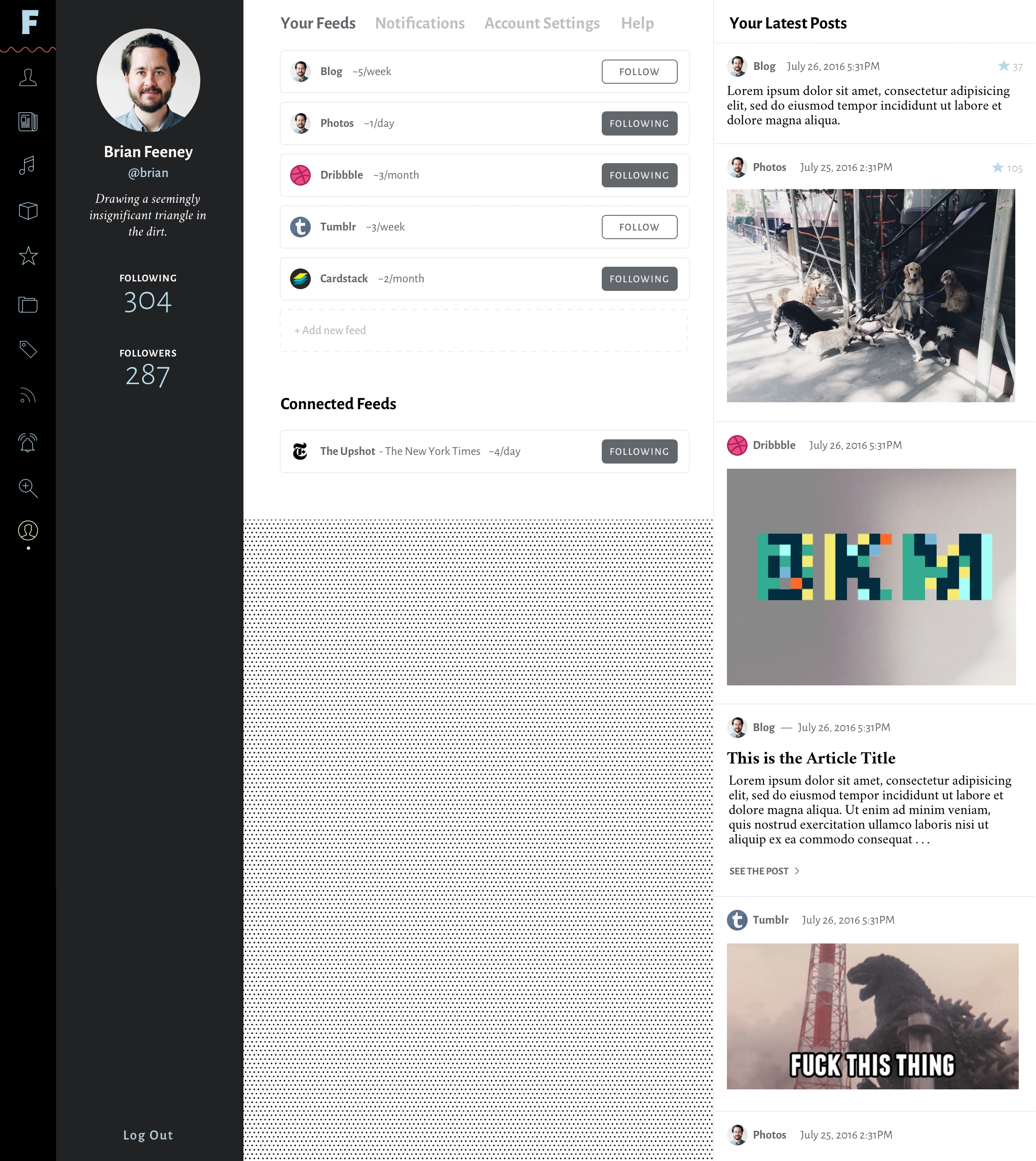
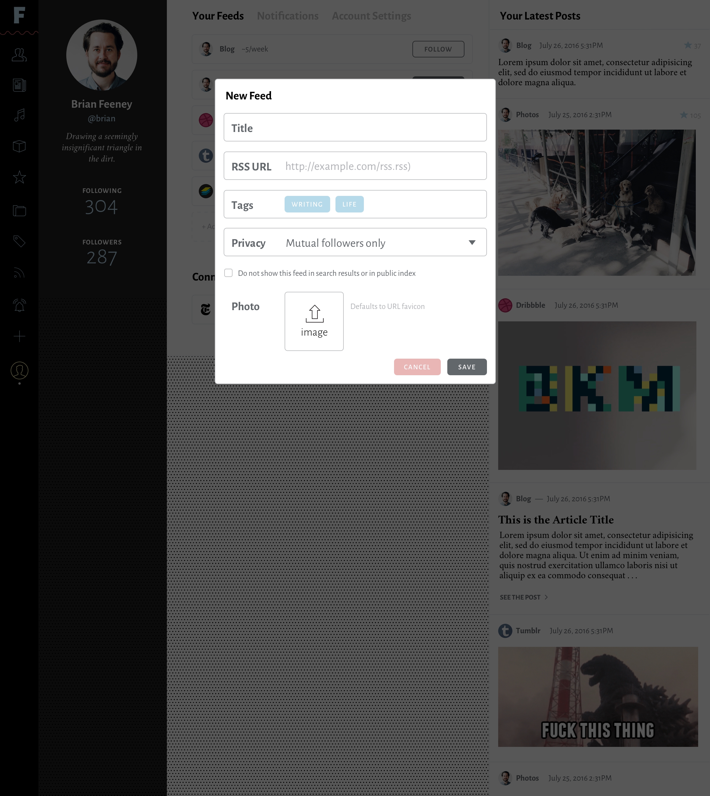
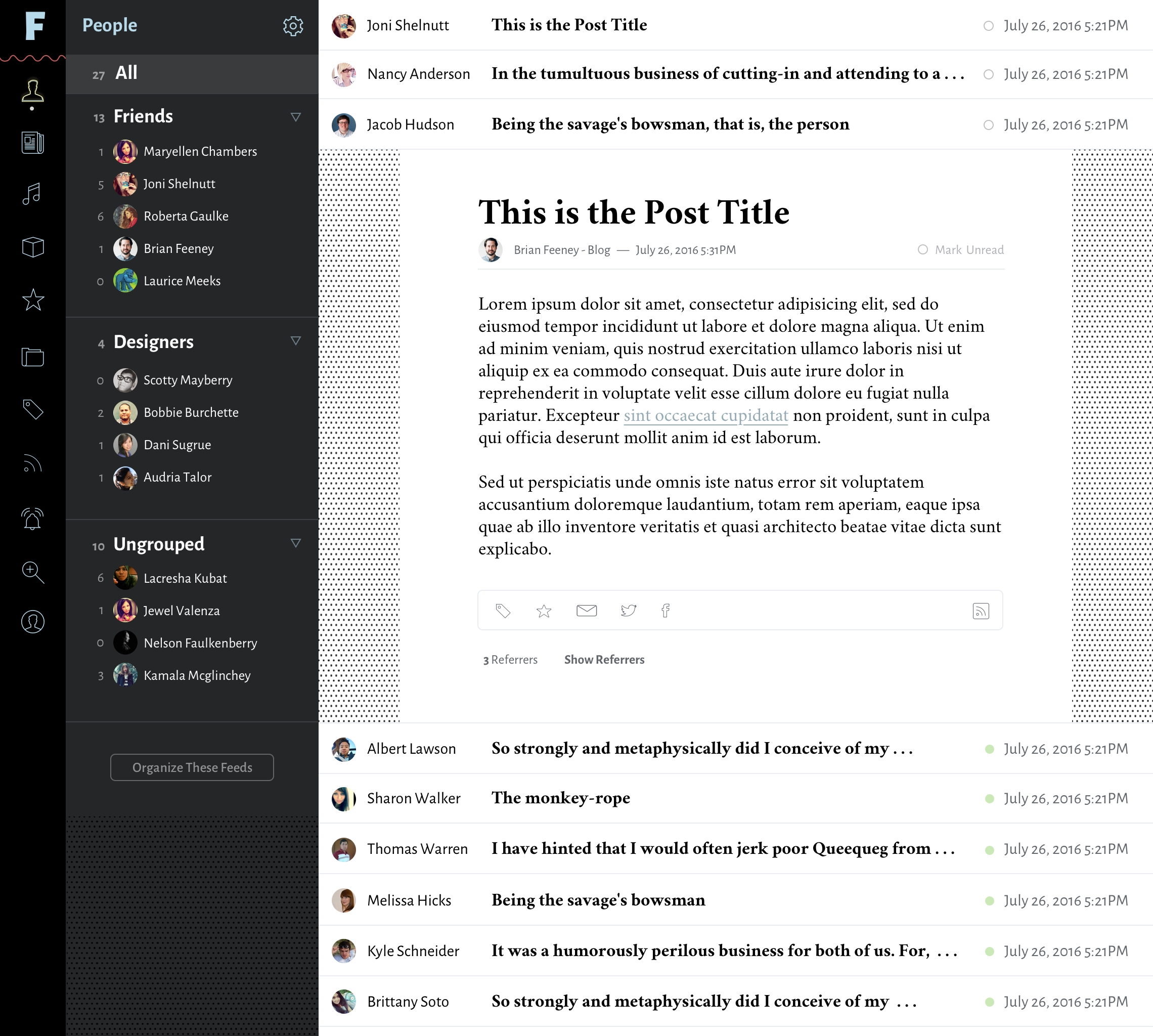

Here in NYC, we don’t get to do nearly anything that used to make living here fun. At least I can still take daily walks and enjoy some nice views. Trying to be thankful for my luck, and thoughtful towards the millions who are suffering more than I.
A month ago, Jonnie Hallman added a "Reply To Jonnie" mailto: link to the bottom of his RSS feed posts. A ton of people then joined him, including me. It's a great idea, a smart way to make blogs a more social medium without them being "social media."
877