Blur at Music Hall of Williamsburg
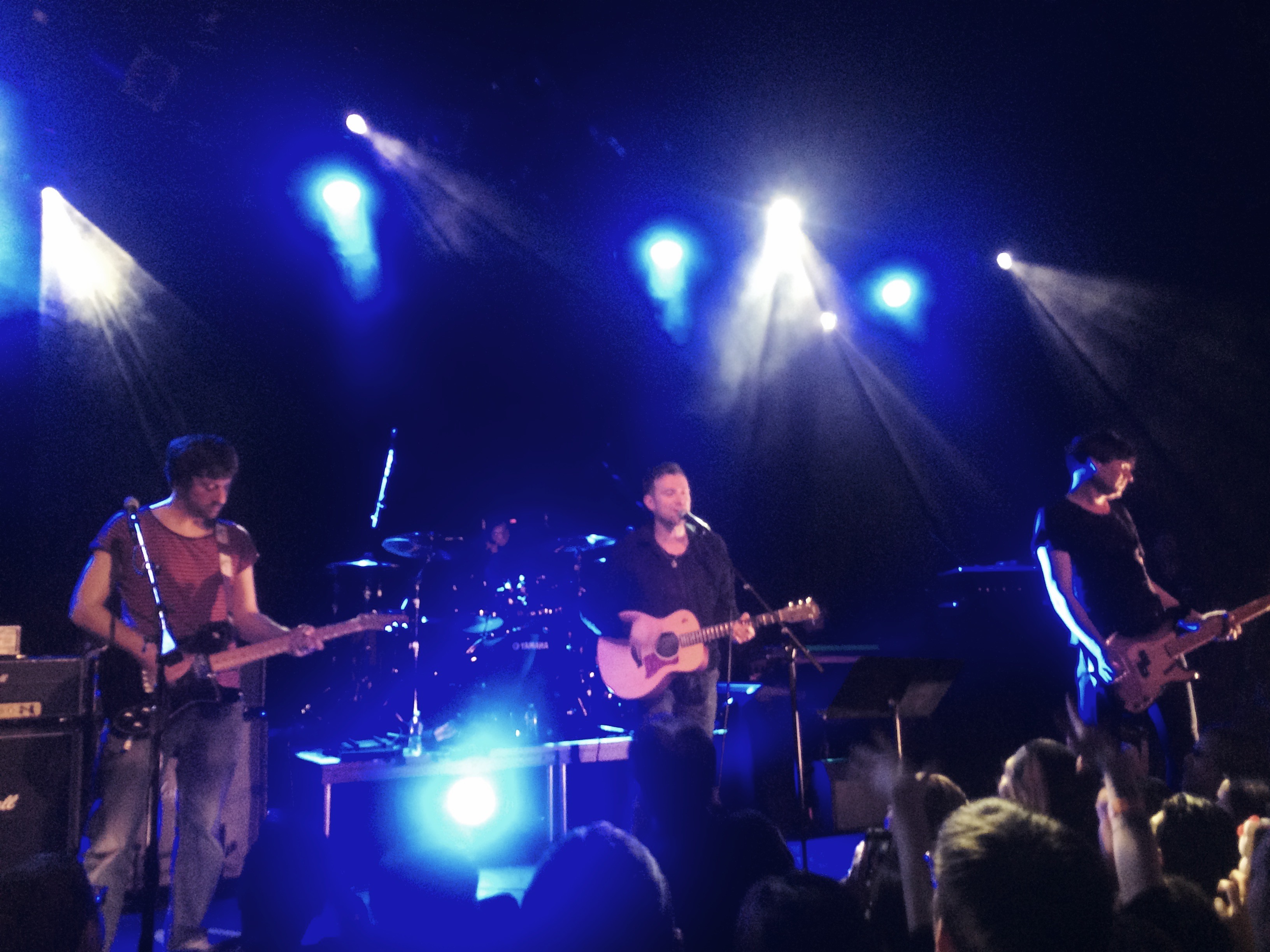
Absolutely incredible to see Blur up close and personal. They played through new album The Magic Whip, plus a few songs in an encore. Trouble in the Message Center was so rocking.
Absolutely incredible to see Blur up close and personal. They played through new album The Magic Whip, plus a few songs in an encore. Trouble in the Message Center was so rocking.
Blur announced this morning that they're releasing a new album on April 27th, The Magic Whip. It's the record they recorded in China a few years ago which was supposedly left unfinished. Clearly it's been wrapped up. It's a wonderful little surprise for me and Blur fans everywhere.
My fascination with Blur goes deep. I know very well every second of every song, all the history, all the side-projects, and all the artwork. I've picked apart their songwriting process so intensely that I could probably list them in the order in which they were written. It's even clear to me when a track from Gorillaz fits chronologically between two songs from 13. I could tell you from intuition that Graham Coxon wrote and recorded You're So Great at the same time as his first solo record The Sky is Too High.
I believe it's important for designers to have at least one artist they know so well, whatever the medium. The creative process is demystified through understanding the relationship between the artist, their process, and history. You can see how good work gets made. Mostly a little all at a time. Sometimes all at once. But always as a result of effort.
Albarn keeps a fairly strict 9 to 5 schedule. He has a studio in London which he goes to everyday and he writes and records and works. It's why he's able to release something every year, and sometimes more often than that. When I first learned of his work ethic, mine was transformed. If I wanted to produce work as good as his, I knew I needed to work every day, like him. There's no waiting for inspiration, no lounging around being some kind of bohemian "creative." Design is a job. Music is a job. Art is a job. This year, Albarn will be releasing a new Blur album, a new Gorillaz record, and a new opera record. I aspire to ship so much great stuff with such regularity.
I also have a ton to say about the visual design for their records and how it relates to their music. Nearly all of their earlier album and single sleeves were brilliantly designed by the design studio Stylorouge. They're bright, bold, and colorful, often using pedestrian images to convey a homeyness, a comfortability, and echoes the variety of tone and breadth of style of Blur's music. They also speak directly to the Britishness of the band and their cultural roots, neatly placing them in a particular time and place. When you look at the spread of those covers, the impression given is that this is a band which knows precisely how to divvy up work and play, when to be serious, and when to take themselves lightly. It's a balance I've always tried to find for myself.
There's no doubt in my mind my love of Blur's music influences my design work. I'm attracted to graphic design with heavy flavor, bold choices, colorful execution, and attention to the tiniest details. This, to me, perfectly describes their music, as well. Endless variety. Endless fun. Serious work ethic. Always a wink and a nod towards "cool," but mostly following their instincts.
It really pays off to intensely study someone's work. It helps to see where inspiration comes from, how it transforms into new things. If you pick apart Blur's work, and you see all their influences (David Bowie, the Kinks, Scott Walker, the Who, Julian Cope, etc.), you can see where elements were lifted, combined, reused, transformed, reinterpreted. Art as a job starts to make more sense. We don't exist in a vacuum, and we don't create anything out of thin air.
When I heard that a new Blur record is coming out, my excitement isn't only over getting to hear new music from some of my favorite musicians. It's also for the opportunity to pull it apart and see how it relates to their previous work, to see how it compares to other music released lately, to sniff out new influences in the music I hadn't heard before. I'm excited to get to work.
Yesterday, Matt Brown and Majd Taby released their new app, Darkroom. It's a remarkable new standard in the photo-editing app category, completely deserving of all the praise it's been getting. Both Matt and Majd are photo lovers and Darkroom shows it. They've built a tool that lets you get inside your photos and photo library in all the ways you wish you could on your phone. And quickly. And easily. And beautifully. I love this app.
For well over a year, I was a heavy user of VSCO Cam. In order for Darkroom to become my default photo-editor, it really needed to do everything better. Or at least just as well. When I heard Brown was working on a photo-editing app, my first thought was, "Shit." What if it's terrible. (Brown is an old friend.) But I'm happy to say that since using Darkroom (I was a beta tester), I've barely opened VSCO at all. Darkroom is simply better. Granted, it's missing all the great filters VSCO has wonderfully curated, but in Darkroom, you can make your own. You could even spend a little time copying the look of your favorite VSCO filters if you were so inclined. I did for a couple, and I'll probably copy a few more. In any case, it can't be long until I reach full filter saturation. How many do you need, really?
One of the things I missed from VSCO Cam was the imported photos feature. For me, it acted as a To Edit Later list, a place to keep all my better images and save them for another day. Turns out there's a great work around in Darkroom, and it's even better for a couple important reasons. The iOS Photos app lets you mark your favorite photos with a click of a heart icon, which are then collected in a Favorite folder. Darkroom gives you access to all your different Photos folders, which means without any fuss I can quickly jump into Favorites and start editing from there. And because I'm not importing images into the app, the app itself isn't growing in size, which was a big problem with VSCO Cam. Right at this moment, on my phone, VSCO is at 313MB in size. Darkroom is 6.1MB. Darkroom wins.
Aside from custom filter creation, the other big selling point for Darkroom is its Curves feature, which you can purchase for $2.99 (the app itself is free), and it's awesome. It's handsomely designed for touch, allowing you to run quickly through each curve and end up with a nicely tuned image at the finish. There will be other features for sale soon, which will add even more functionality to an already great app.
My iPhone is the camera I use the most because it's the camera I always have with me. Apps like Darkroom makes it even better.
Though I'm employed full time by the Brooklyn Museum, I also take freelance work. I do this for a few different reasons. 1) The extra income. 2) For keeping both my design and development skills in practice. 3) To help out friends. 4) Because I love making things .
Because of number 4, I say yes to just about anything that comes my way. This sometimes becomes a problem because I tend to make terrible assumptions about my time. Namely, how much of it I actually have to work.
This is one of the reasons Jonnie Hallman has created Cushion. It's a web app with two very meaningful purposes. One is for tracking your income as a freelancer, making sure you have enough work scheduled to be financially stable. The other is to help make intelligent decisions about scheduling the work so that you're not doing too much at once.
Since I have already have a sustaining salary, the income tracking feature is only a nice-to-have for me. It's great to see in one glance, though, and if I ever did go fully freelance, it would immediately become a need-to-have feature. But the scheduling view -- that is a feature which really pulls its weight for me.
Two things Cushion has shown me so far:
1) I did a pretty good job scheduling my freelance work in 2014:

2) 2015 is starting to look a little top-heavy.

I'm really glad to have seen this displayed so clearly. Seeing my time commitments in this way makes me feel empowered. I have a better grasp on how much work I can handle and what kind of promises I can and cannot make to current and future clients. This was definitely worth the cost of joining the paid beta.
There's a paid beta. If you're a freelancer, I'm already prepared to say that Cushion is worth it. And Jonnie is a good dude. Much respect for building a great, very useful thing.
I've only played a handful of iOS games. While many are fun and well designed, Monument Valley is by far the most beautiful. It's especially engrossing on the iPad. I fall right into it. That's not even mentioning how much fun it is. Great little mind-bending puzzles all over the place. I highly recommend it. The second set of stages was released yesterday, as an in-app purchase.
My first post for the Brooklyn Museum Tech blog went up October 20th: The Design Spin Cycle. In it, I tried to explain what it's like jumping into a huge project which had already gained strong momentum with respect to research and purpose, but hadn't yet found it's shape. We knew the goal for what we would eventually build, but we didn't yet know what we would end up building. I also tried to hint at how much I'm designing -- as in, the size and scope of it all. There are a lot of different pieces, some much larger than others, some public facing while others are for internal use, and I'm trying to be very deliberate about how I'm approaching it all at once. I'm very aware of being the sole designer on the project, and I want to be sure my design process includes the rest of the team as much as possible.
I might repost it at brianfeeney.us at some point, either in this blog or some other page for posterity.
Mandy Brown, from her recent newsletter:
[The] repository of the world’s knowledge has ever been too large for most people to know it completely, and it keeps getting bigger. In that context, choosing to surface history that is technically available but obscured by the sheer enormity of human experience is a kind of radical act. Maybe what we need are not writers who can tell us something new, but those who can plainly remind us of everything we failed to remember.
And she's absolutely right. In the last few hundred years, we've amassed an unfathomable amount of knowledge and wisdom. Finding our way through that is a herculean task, and it's not something our education system is prepared to tackle either. Perhaps a new generation of journalism could be?
I've long had the feeling that the pendulum-like swing of philosophy has also slowed to an almost full stop. From what I can tell, we've tested all the extremes -- Existentialism to materialism, authoritarianism to totalitarianism, romanticism to realism, etc. -- and are now doing our best to be pragmatic with what we've learned. It's still difficult to make sense of it all, though, without Master's degrees or years of sacrificial reading. There's too much to know and it all requires so much context to understand properly.
I suppose longer-form journalism has always been a kind of continuing education. It would be nice to push this kind of writing into the foreground. If this is what Brown is proposing, I'm all for it.
As an attendee to the fifth and final Brooklyn Beta, I feel I owe myself a blog post on the experience. I didn’t take any notes while there, though. For that I’ll point you towards Erica Heinz's post, which seems wonderfully complete. The talks were all good, some were great, and a couple will stay with me for a long while.
As this was my second year, I feel I have a better handle on what made the conference so great. It’s the motto: “Make something you love.” Chris and Cameron filled the rooms of BB with people who love making things on the Internet. And that simple fact created an atmosphere full of fun, inspiration, and comraderie.
Those of us who love making things for the Internet, we’re a different kind of people, it turns out. We’re a legit tribe. We encourage people to talk about their passions, and then we encourage them to make them happen. We’re people who love to make things and love to hear about what other people are making. Not everyone is like this. And not everyone needs to be, of course. But BB brought these types of people together. Being one of them, I found it a wonderful experience.
In the week post-Beta, I ended up in two situations where I was among large groups of friends and acquaintances. There was plenty of fun and good-time-vibes, but even so they were missing that stange BB spark. They were missing that central love of making things for the Internet.
I’m an introvert in my core. But it was somehow very refreshing to have conversation after conversation with friends and strangers for three whole days without really wearing down. Why? I can’t really say, except to guess it has something to do with the shared curiosity and enthusiasm at the conference. Maybe I’m not really an introvert through and through. Maybe I feel energized when I’m able to talk freely about making things. I love hearing what people are designing and building and dreaming about one day creating. It’s so much fun.
So there won’t be another Brooklyn Beta, but I really hope something fills the void it left. Maybe all I need to do is keep in touch with the people I met there and keep those conversations going. They’re going to keep building and making things whether or not there’s a yearly conference to attend. I want to keep up with them. I want to encourage them. And I want them to encourage me. I want all these good Brooklyn Beta vibes to keep vibing.
Stephanie Rosenbloom, in a post for the New York Times writes about visiting museums at a slower pace. It's a bit coincidental as I had recently tried this exact experiment. A month ago, I visited the Metropolitan Museum of Art, and I spent nearly all of my three hours there studying a mere half-dozen works.
I was really taken by the display of Greek coins. They seemed more real than our modern versions. That’s because of the inconsistency, irregularity, and imperfections. It was clear they were man-made, melted shapes of copper and iron. I’d love to have a pocket full of them to spend. Three-dimensional, with character and personality. Portraits, turtles, flowers, horses. Imperfection adds beauty. I’d love to see more unevenness in everything. More bends, cricks, cracks, flaws.
Breathtaking patterning. Impressive size. The painted patterns had a flow like an animated breeze, or trickling streams. Also with jagged points like teeth or plant needles and thorns. It was the beauty and danger of the jungle painted on a low ceiling made of large sheets of tree bark. Never realized before how patterning could so clearly represent the spirits in the world. They speak a kind of magic. It works on the deepest, most animalistic layer of our brains. And they’re pretty.
So fake and dreamy and amazing. Like a living diorama. It’s an idealized, almost comic, image. Cartoonish but darkly so. The moonlight is far too bright in the foreground, as if it were stage lighting. The forrest in the distance is made up of bubble trees; no attempt at realism, which makes it that much more comic. The painting is fun, first, but also creepy like a dark joke. We often romanticize the past like this. We even the edges and smooth out the narrative, which noticeably distorts the scene if you then look too close.
I first studied this painting in elementary school — I have a vague recollection of copying it in crayon. It’s much better in person. Rich in color with textured outlines. Textured flatness. It reminds me that we lose a lot of depth when we design everything with such strict lines and smooth, unblemished colors. Digital screens will long lack the tactile quality of this painting. Figure 5 is an example of an older thing which is still so much better than the newer things.
I Saw the Figure 5 in Gold feels as much like design as it does art. It’s probably the care taken with the painted type. The beautiful “5”, the gothic “WCW” and “CD”, the lettering on the shop window. It moves within your periphery when so large, fluid and exciting. Red yellow gray cream: an excellent and stirring palette. I aspire to this.
Rousseau was a painting hobbyist. He wasn’t formally trained and I’m sure he didn’t start out painting thinking he’d be so revered 100 years later. One of his greatest traits was his determination. He was considered finished paintings which often still looked very juvenile. He didn’t care that he hadn’t yet learned to paint things correctly. He painted, considered it done, and moved on. Look at the trees in this painting: they're horribly conceived, deformed really, but the painting is still pretty and likable.
Very active and living. I like imaging the world as allegorical people, imaging the workings of the universe as daily jobs performed by gods and spirits. It makes the world seem more both more magical and mechanical. But also more human, somehow. If you imagine everything in terms of human/godly work, it's much more relatable. Look up at the sun. Why not see Apollo in his chariot, surrounded by a swirl of horses and cherubs, doing his daily duty, trekking from East to West. I sometimes fall into the trap of removing myself from the world — not a super rare mistake, I know. Perhaps I — or we — could use more of this magical thinking in our lives. More spirits, elfs, cherubs, devils, gods. I don’t know. But I do know that this painting is beautiful, and it represents to me something we’ve lost.
This statue is frightening in a way almost nothing else is. Terror in a waking dream. A nightmare come to life. It’s deeply, spiritually horrific. What a soul might look like as its being torn apart. It suggests a culture much more connected to do death. More aware of it. More involved in it. More respecting of it.
6634
