The UX of BFUSv8

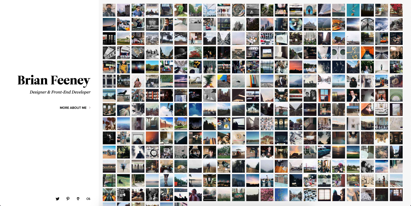
This is my site. I'm a designer, the UX is terrible, and I like it that way. For now, at least. Let me explain.
I love having a website of my own. I believe everyone should. Ditch Facebook. Walk away from Instagram. Pick a blogging platform that you can run yourself, even host yourself. How you run that website is completely up to you, which is really the whole point. You get to decide what visitors see first, where the contact info is buried, wether or not you allow comments or any kind of interaction at all.
Two decisions have shaped the current iteration of brianfeeney.us. One, I'm assuming very few people are looking for me. If it can be trusted, my analytics put my visitor count at around 15 people a day. Hi! What are you here for? Probably for little more than seeing that yes, I exist, and that is my correct twitter handle. You want more? Click the "More about me" button. There you'll find my portfolio, résumé, and contact email, and links to the other site pages.
Does anyone really visit to read my blogs? Either the photos or the writing? ¯\_(ツ)_/¯ But the links are there if you want them. Which brings me to decision two, which is that I'm assuming if you are interested in my blog stuff, what you probably really want is the RSS feed for following along in whatever reader you use. This is mostly why the blog isn't on index.php, but the RSS icon is set so large. So click that RSS icon and pick the feed or feeds you want. Also, I don't post much or that often, so daily visits or even occasional visits aren't really worth it. RSS is the way to go.
I'd love to redesign and rebuild this site sooner rather than later. In fact, I've redesigned it a few times since launching this version. Just didn't care for the new designs any more than this one, so why rebuild it? I'm sure I'll get the itch to try out the new CSS bits before long.
